Roadmap to Wireframe
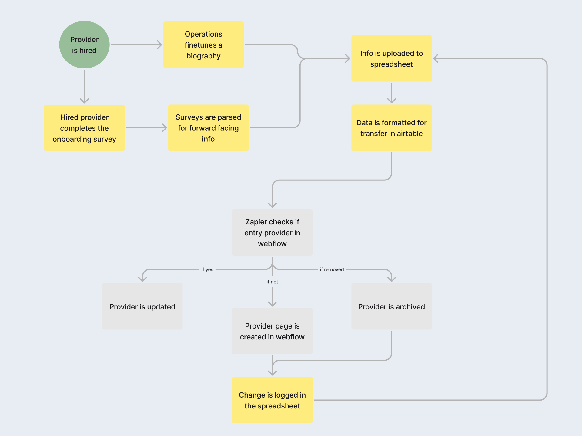
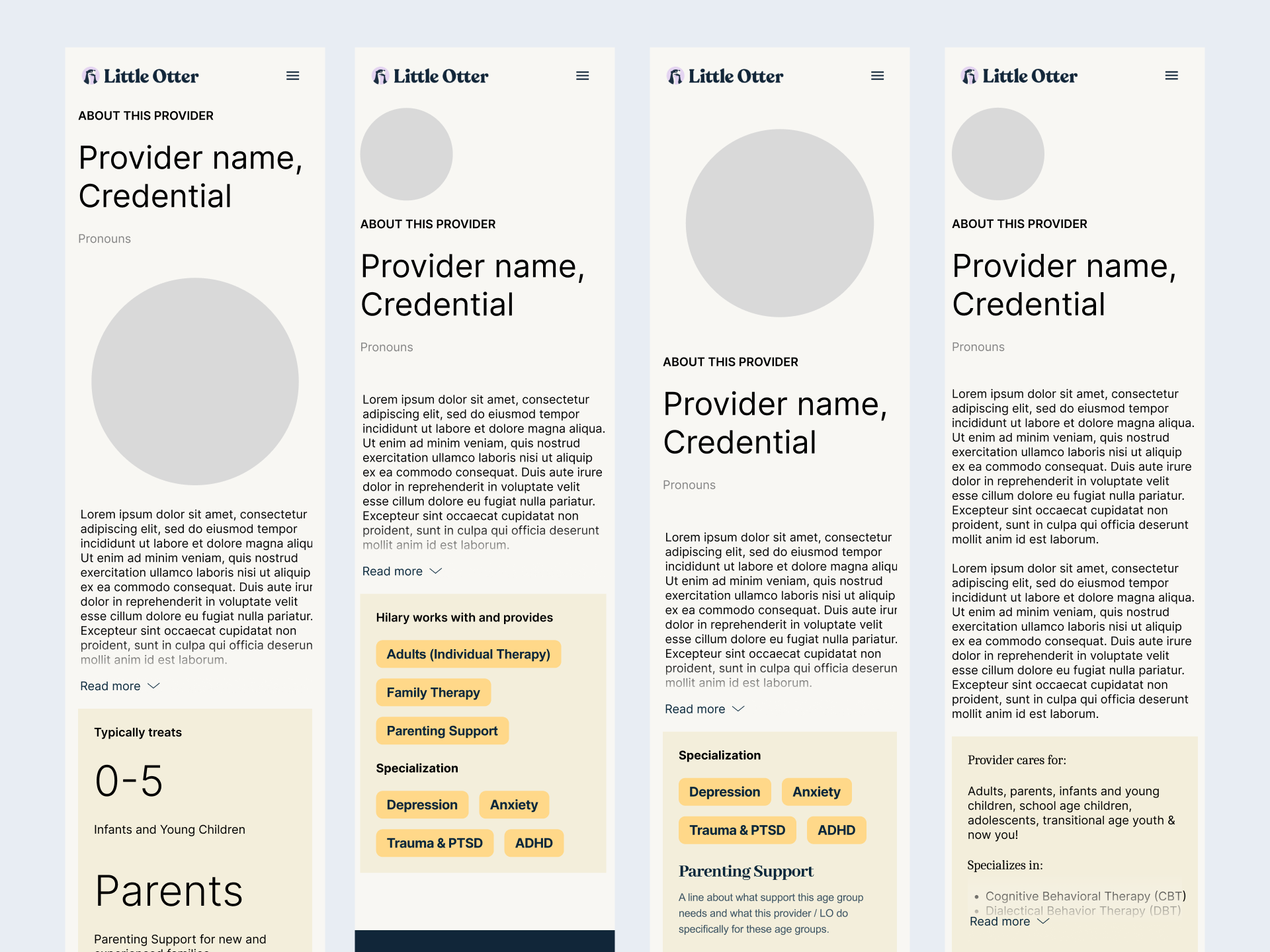
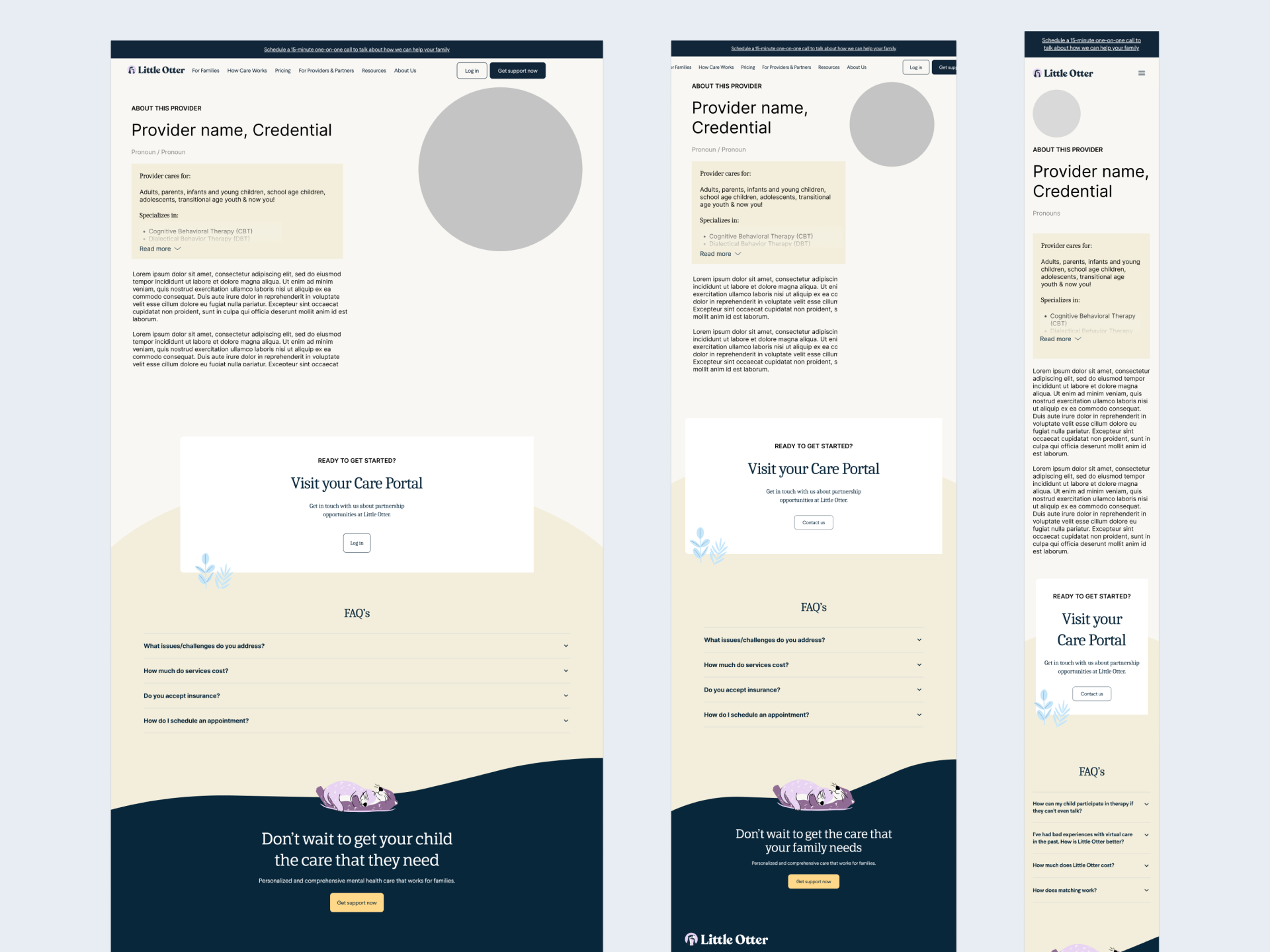
We created a solution that handles needs of sales, clinical operations, and product teams before it even gets to the families.
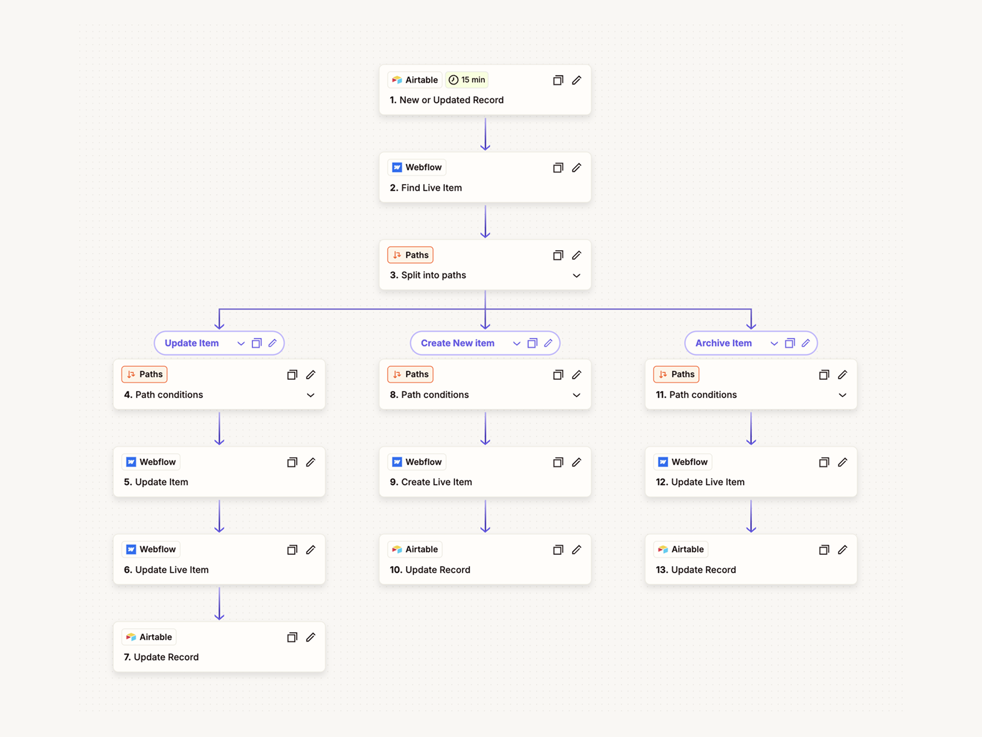
Data integration across teams made onboarding scalable, and provider introductions warm and clear, while Studio Rodrigo's brand system makes every touchpoint professional.
Testing surfaced the data formatting gaps preventing consistency, giving us a clear path to strengthen the system and raise the overall development quality.
Impact
Hundreds of providers have been launched with this feature: with an enduring system we made so many great introductions to mental health care.
Families have assurance and an artifact they can return to
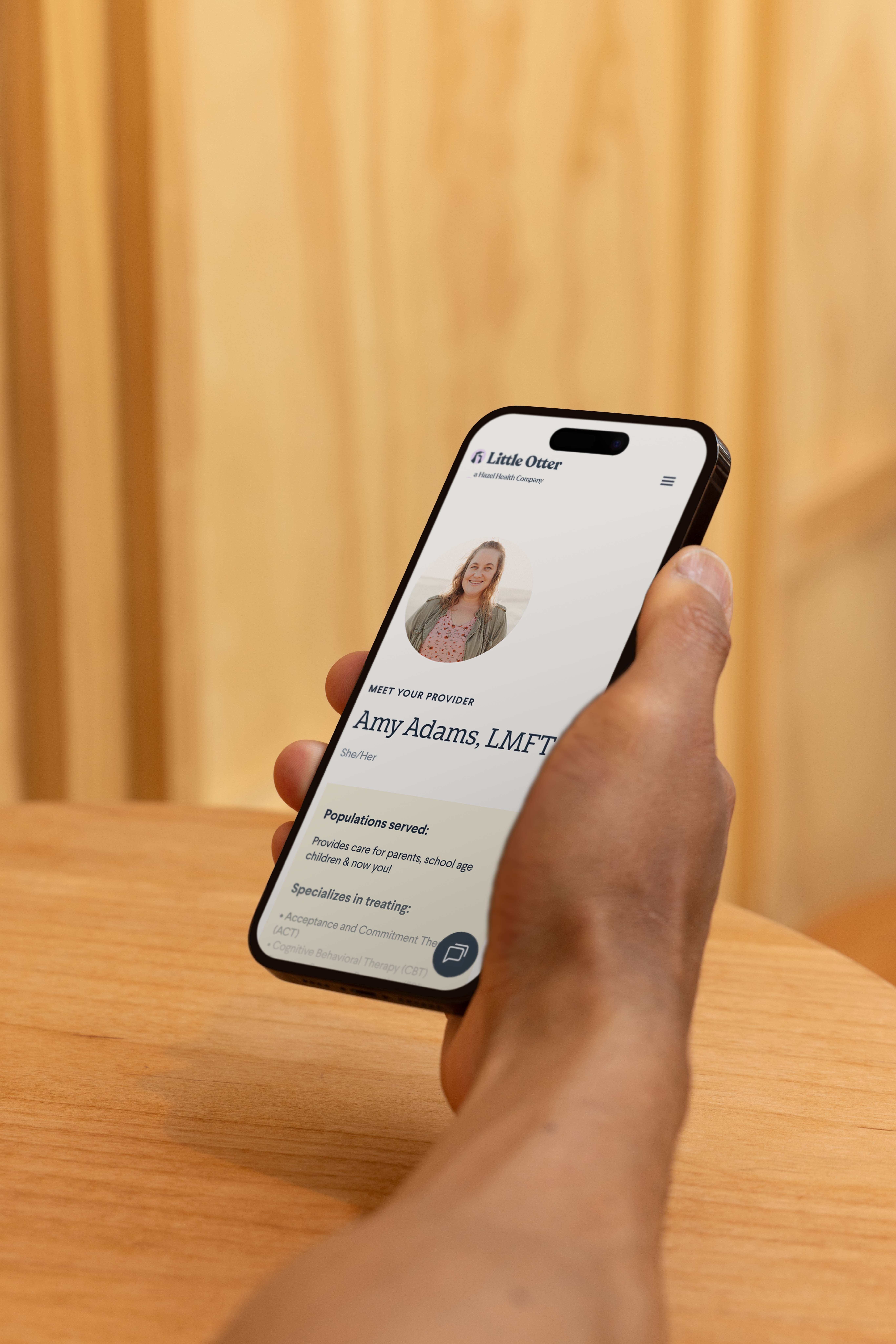
They wanted to know who this person is, what their background is, and how to access their portal without navigating internal tools. Providing this point of contact that can be returned to, as opposed to a phone call or email, lowers anxiety and smooths the start of care.
Sales has one touch point to introduce a provider
Sales needed a dependable way to introduce providers without piecing together details from scattered tools. The new provider pages give them a branded single link that replaces manual back-and-forth, reduces errors, and helps close the loop with families faster. It makes sales look organized, informed, and consistent every time.
Operations has a single place to upload information
Before, this process was not intuitive. Providing a central flow that supports the connection between finding and using design elements is what this focused on.
Our collaboration with Little Otter includes maintenance and ticket clearing of the site includes this project and dozens of landing pages.
