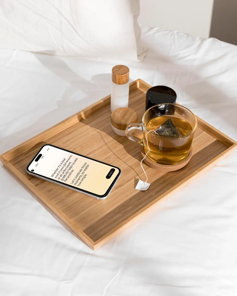
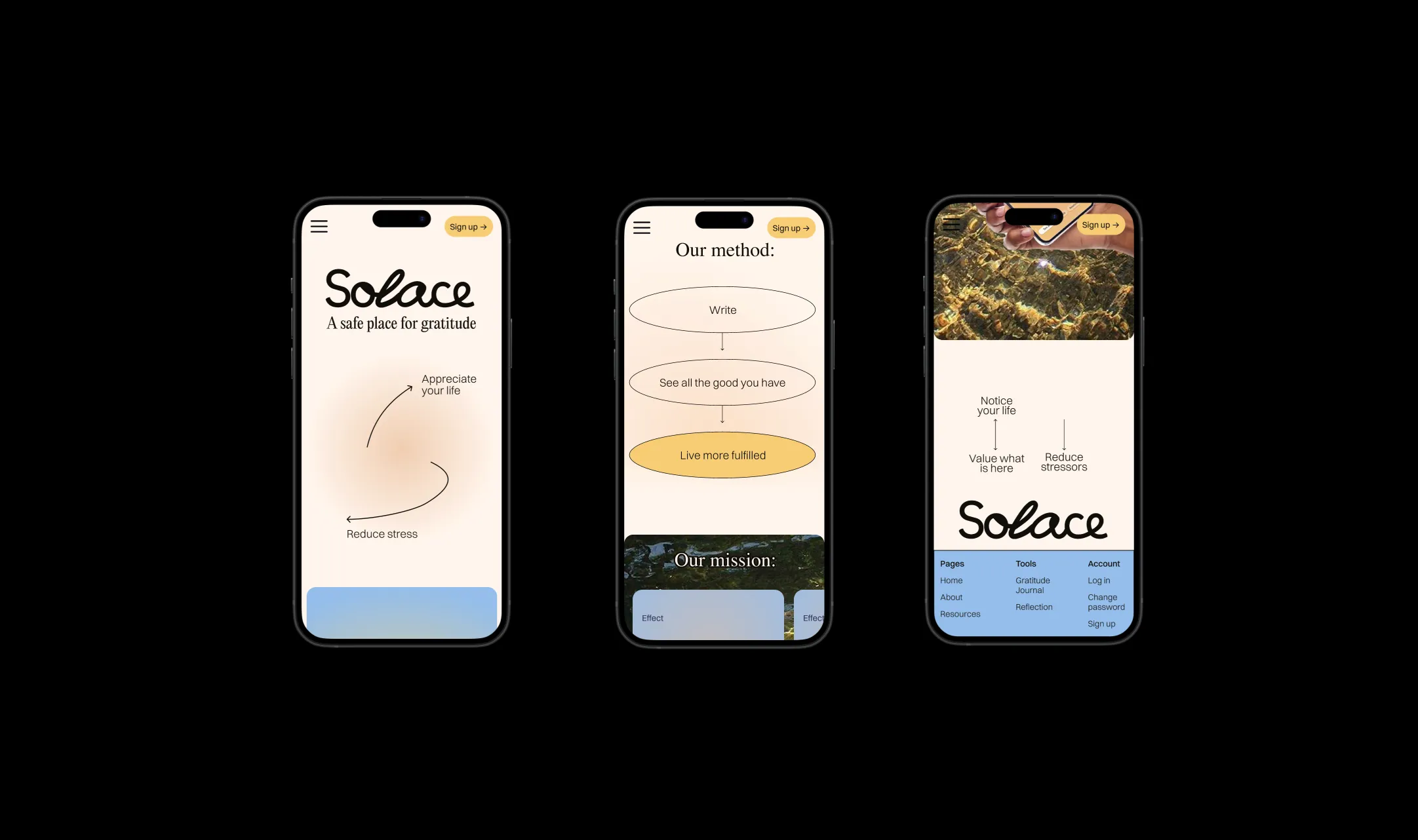
A safe place for gratitude
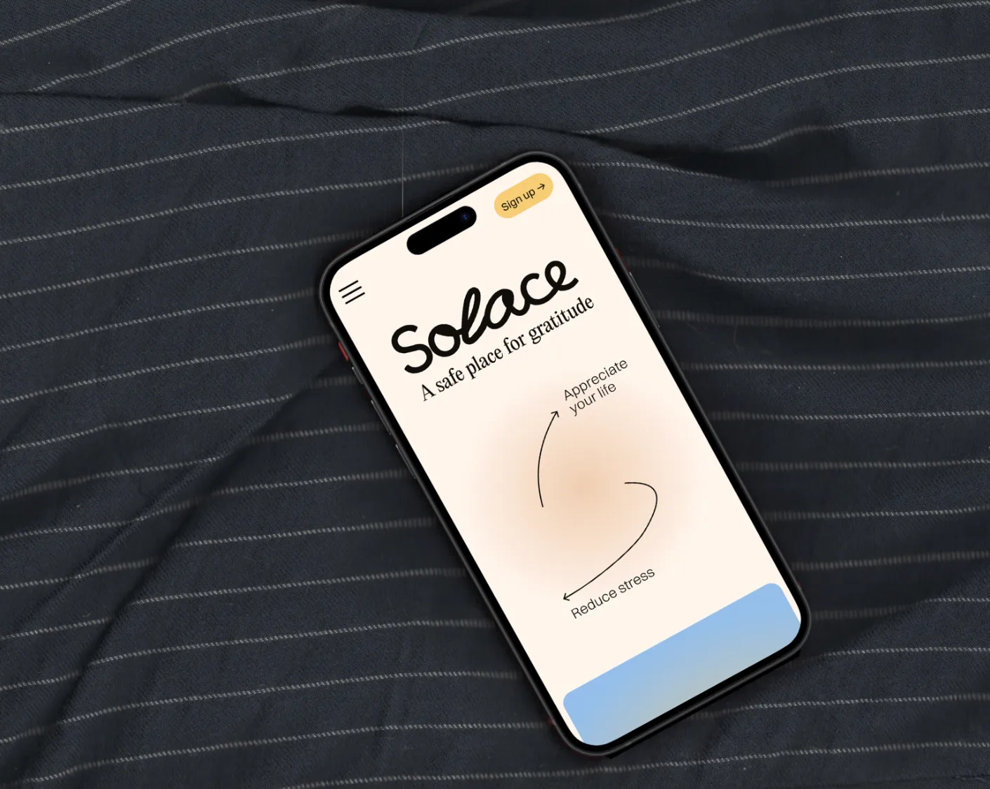
Solace offers a user-friendly platform where individuals can reflect, track, and enhance their well-being in a simple, enjoyable way, making the practice of gratitude an effortless part of daily life.
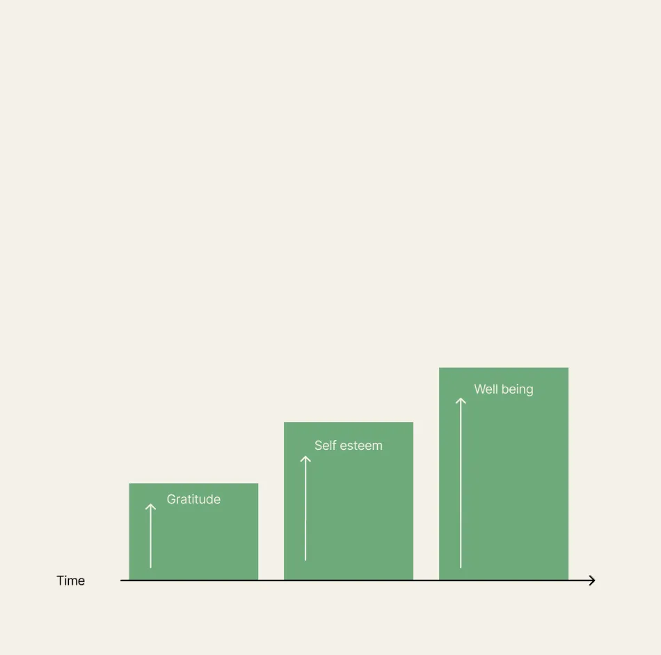
Solace is designed to create more fulfilling lives by fostering gratitude and reducing stress. It achieves this by seamlessly integrating the transformative benefits of gratitude with an intuitive, self-guided journaling experience and personalized reading recommendations.
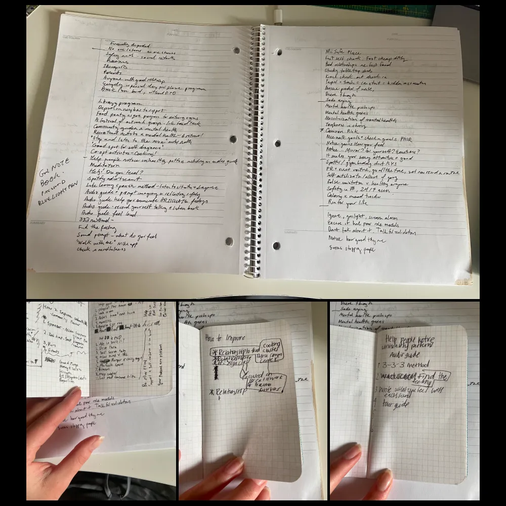
Research
The initial goal of research was to know what occurs early in unhealthy relationships so that we can productively interrupt with research insights.
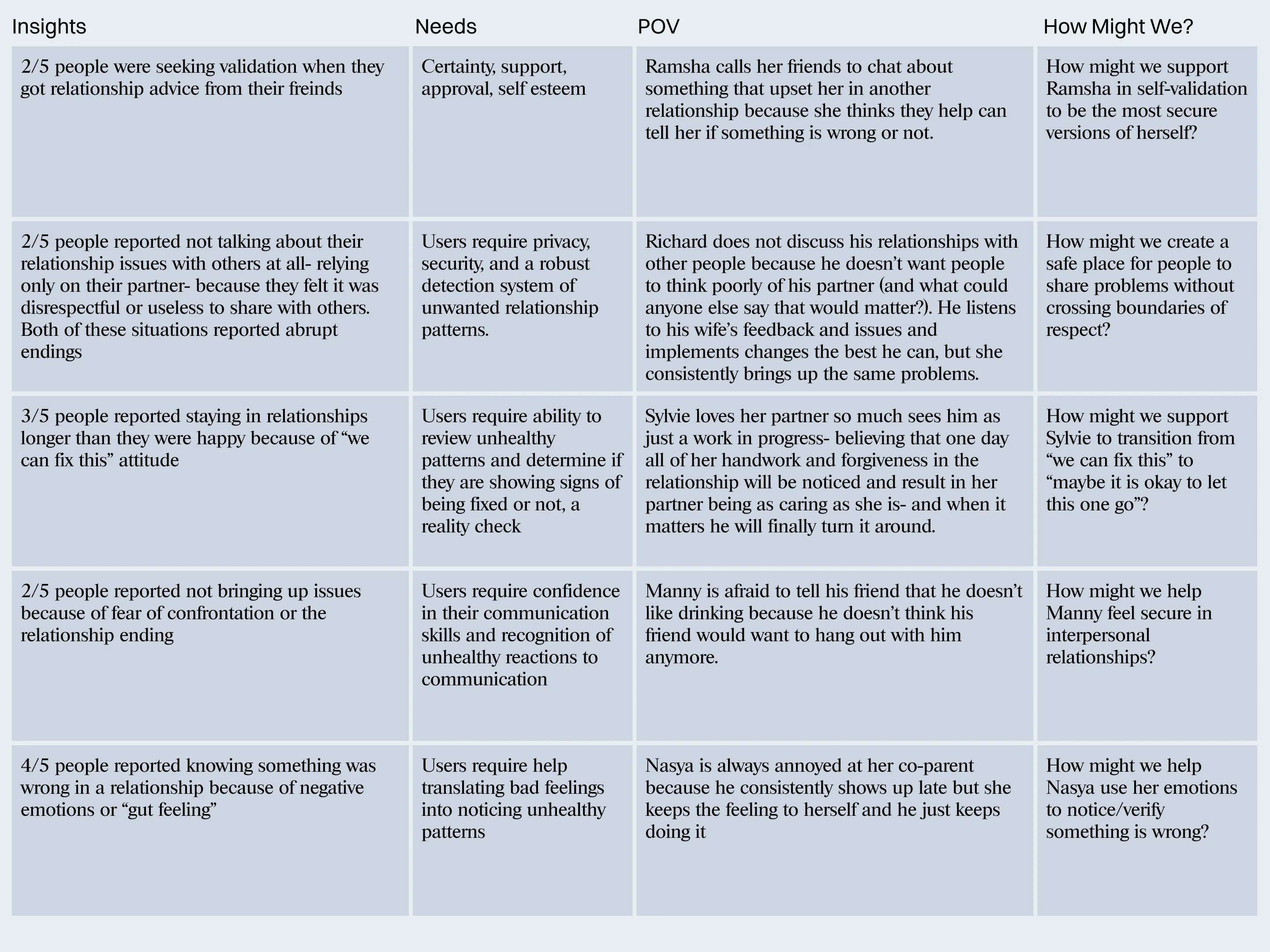
4/5 interviewee's used their emotions to let them know when things in relationships are feeling unhealthy.
The people interviewed had admittedly not scarring former relationships- in more abusive relationships emotions are known to less reliable.
3/5 participants did not feel comfortable talking to others about their problems.
They did not want people to think poorly of their partner, or they did not think others could help.
The most telling take away was that 2/5 participants mentioned seeking "validation" from those they confided in. Taking advice given was less important than feeling heard.
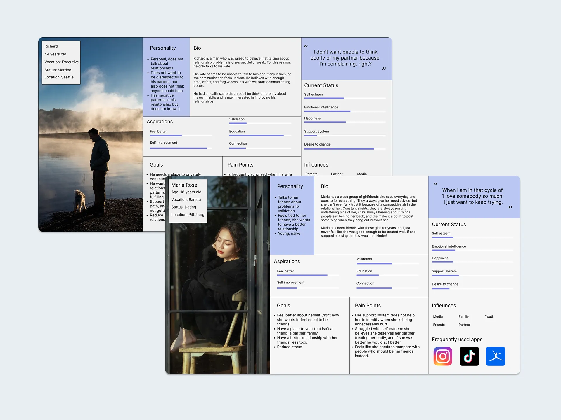
Personas
The personas resulting from the research: Maria and Richard.
Maria is a younger girl seeking ease of relationship with her not-so-good friends.
Richard is an older man both reflecting on his life and working in his marriage.
Gratitude was chosen as an interruption to the problems associated with self-esteem here are some reasons why:
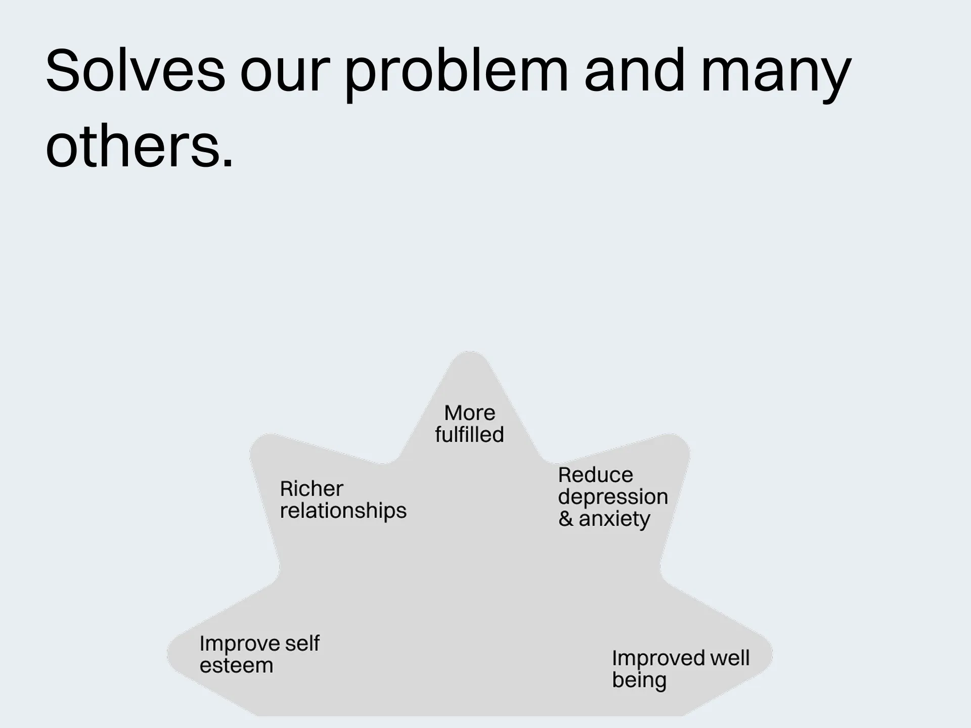
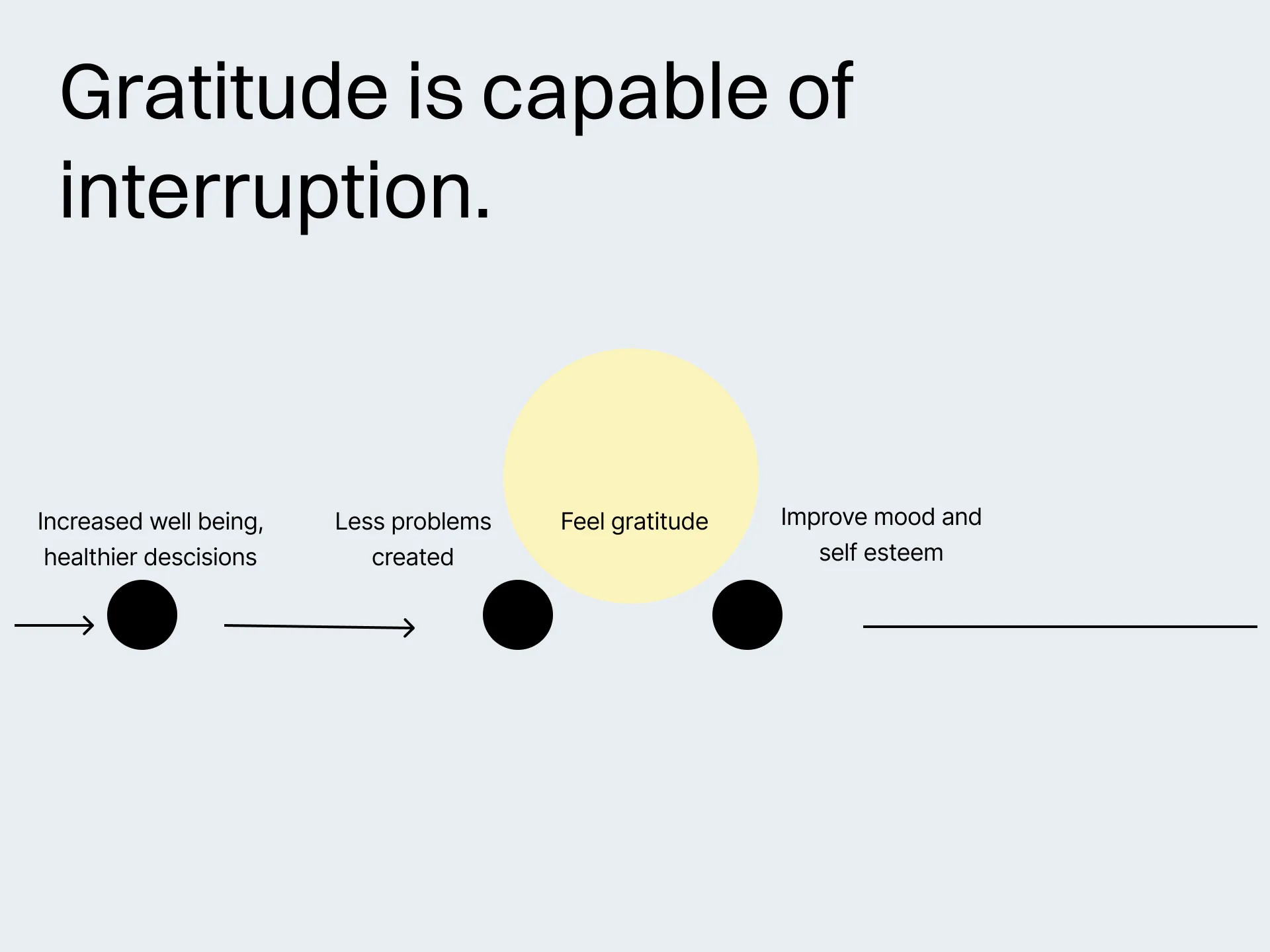
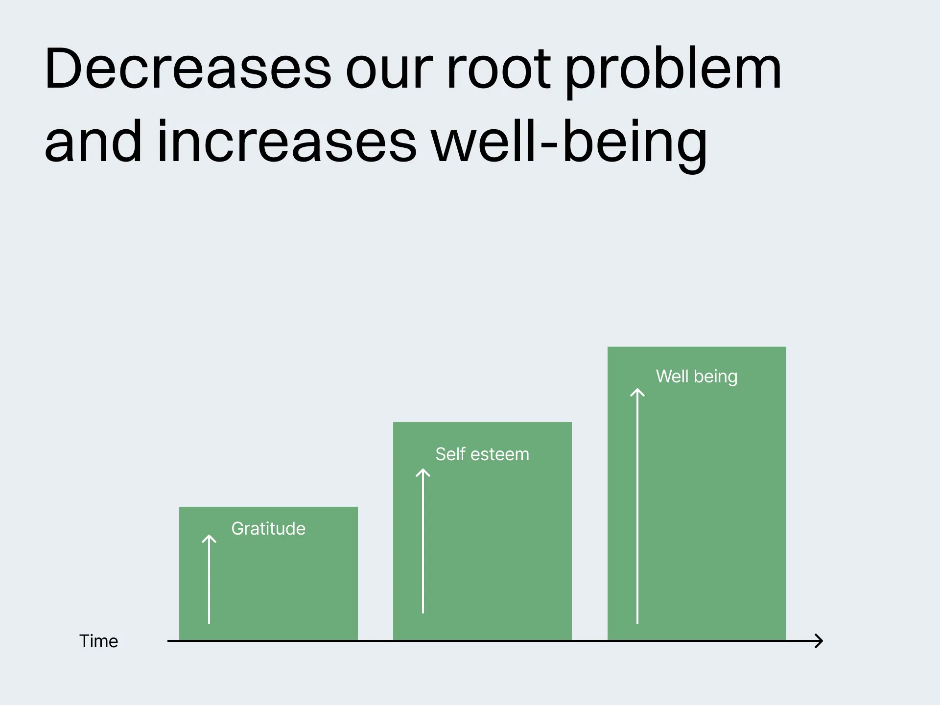
60% of our participants stayed in relationships even when they became discernibly unhealthy. Our personas do so for different reasons. Gratitude is able to get ahead of both of their problems.
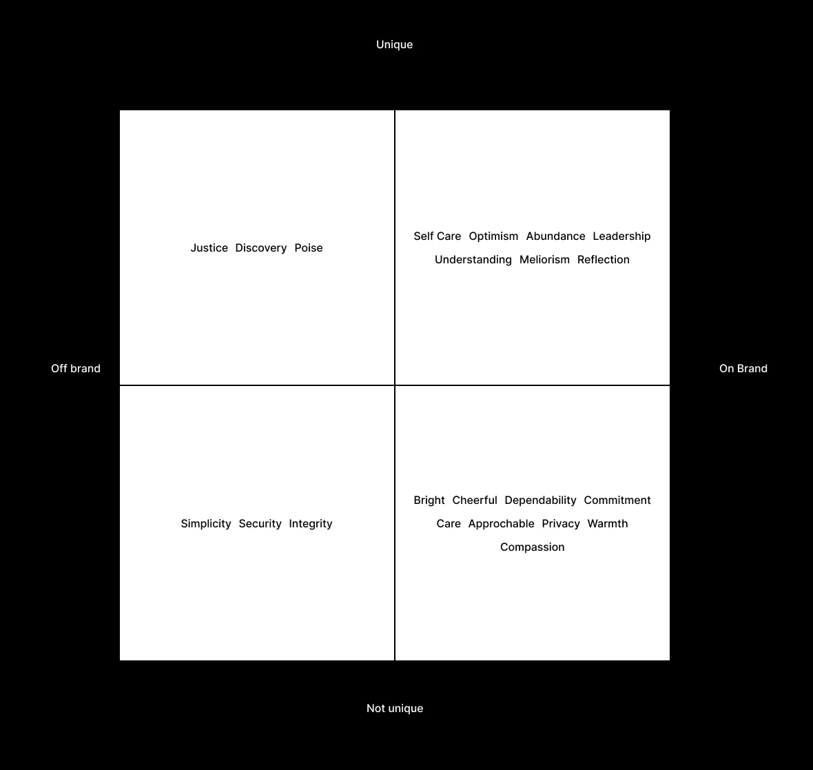
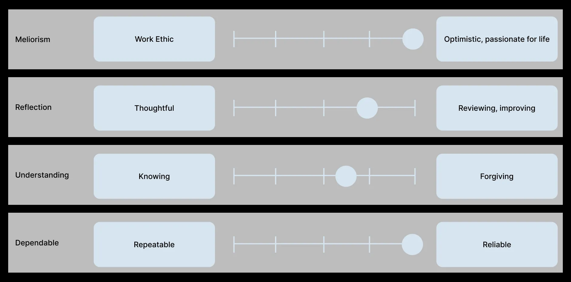
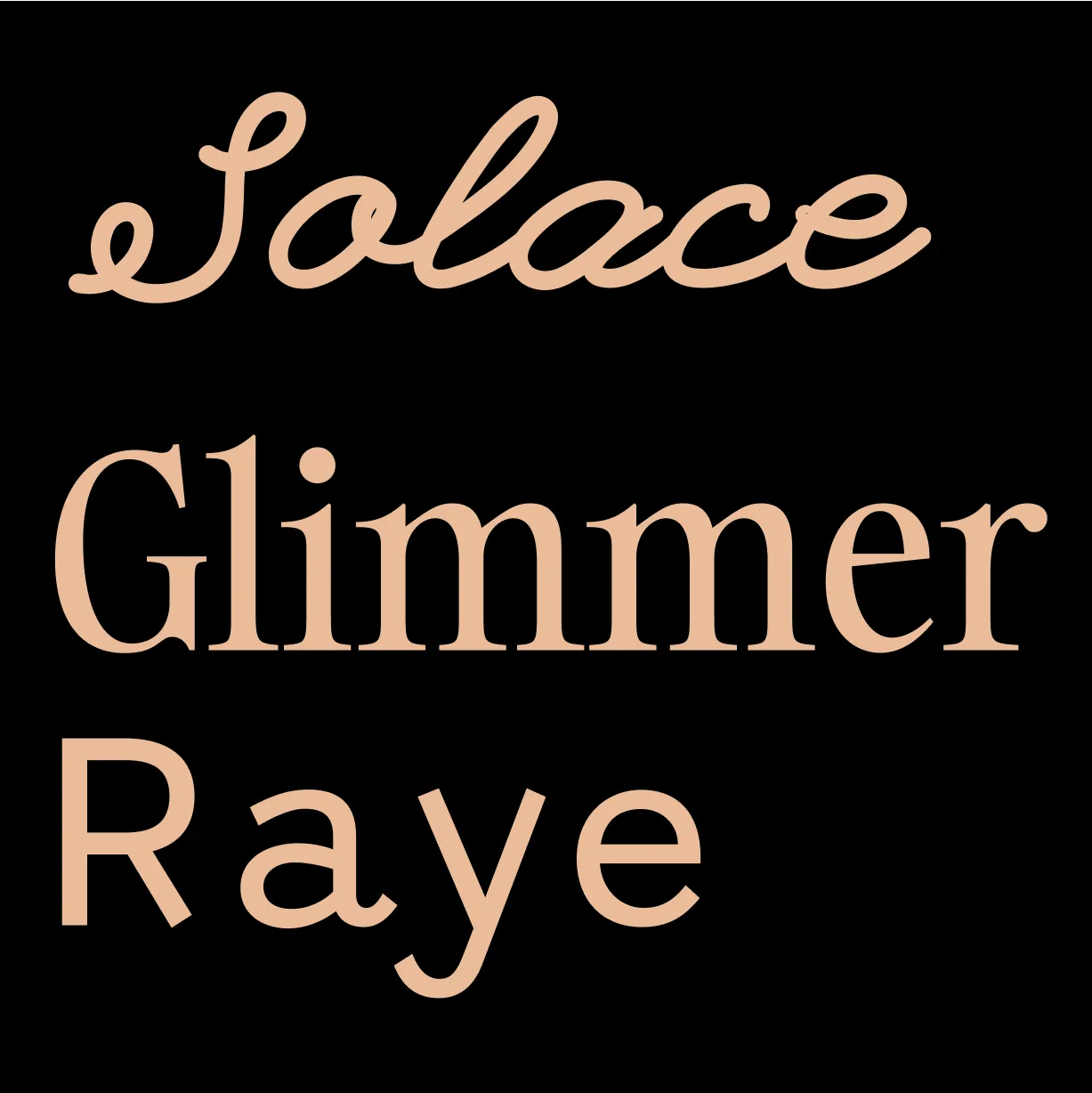
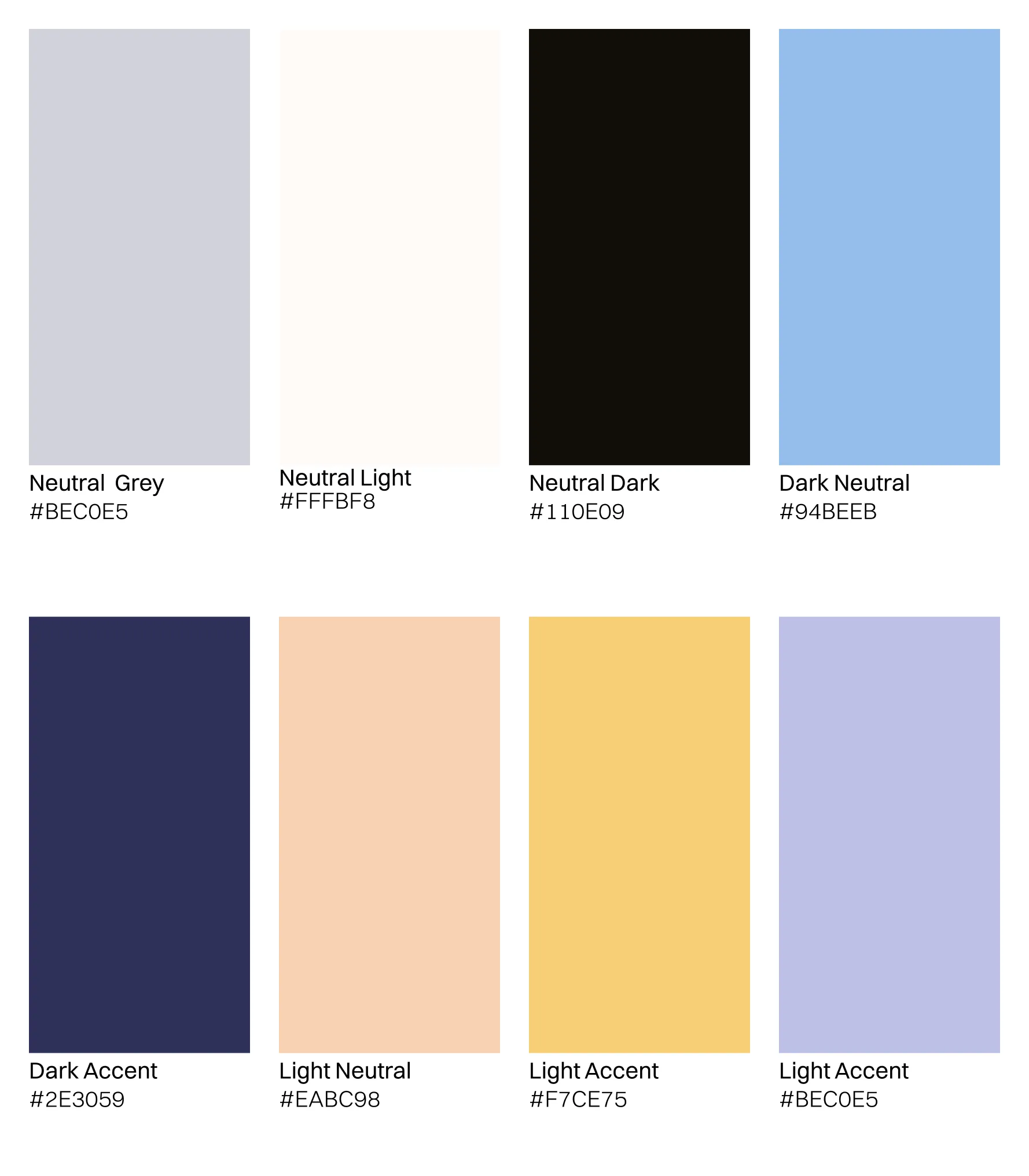
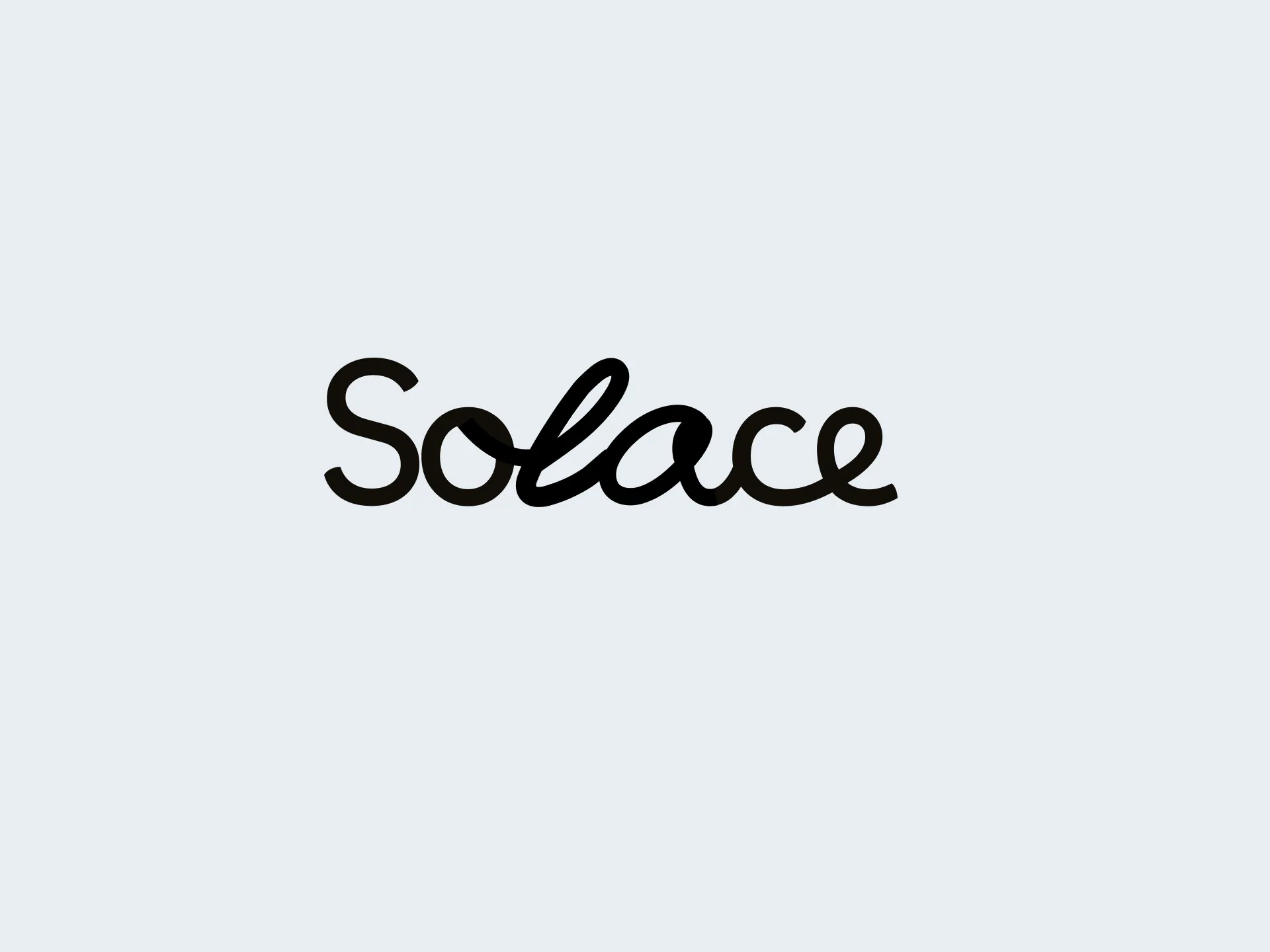
Branding
The now defined gratitude application deserved to be positioned as bright, hopeful, and optimistic as the core functions are.
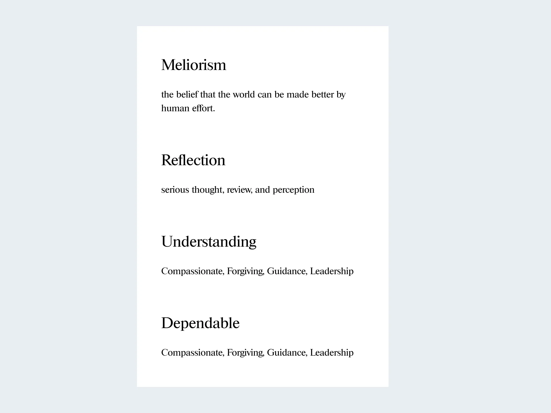
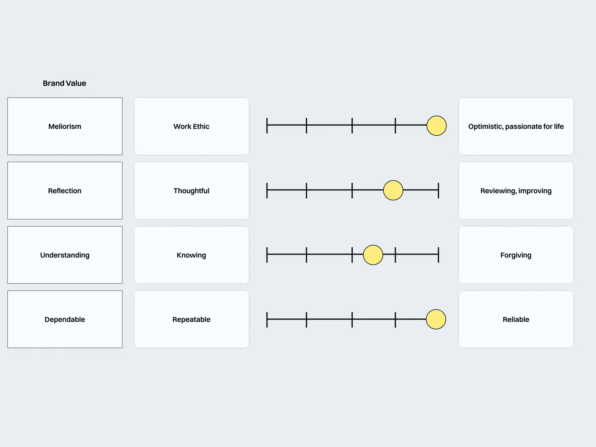
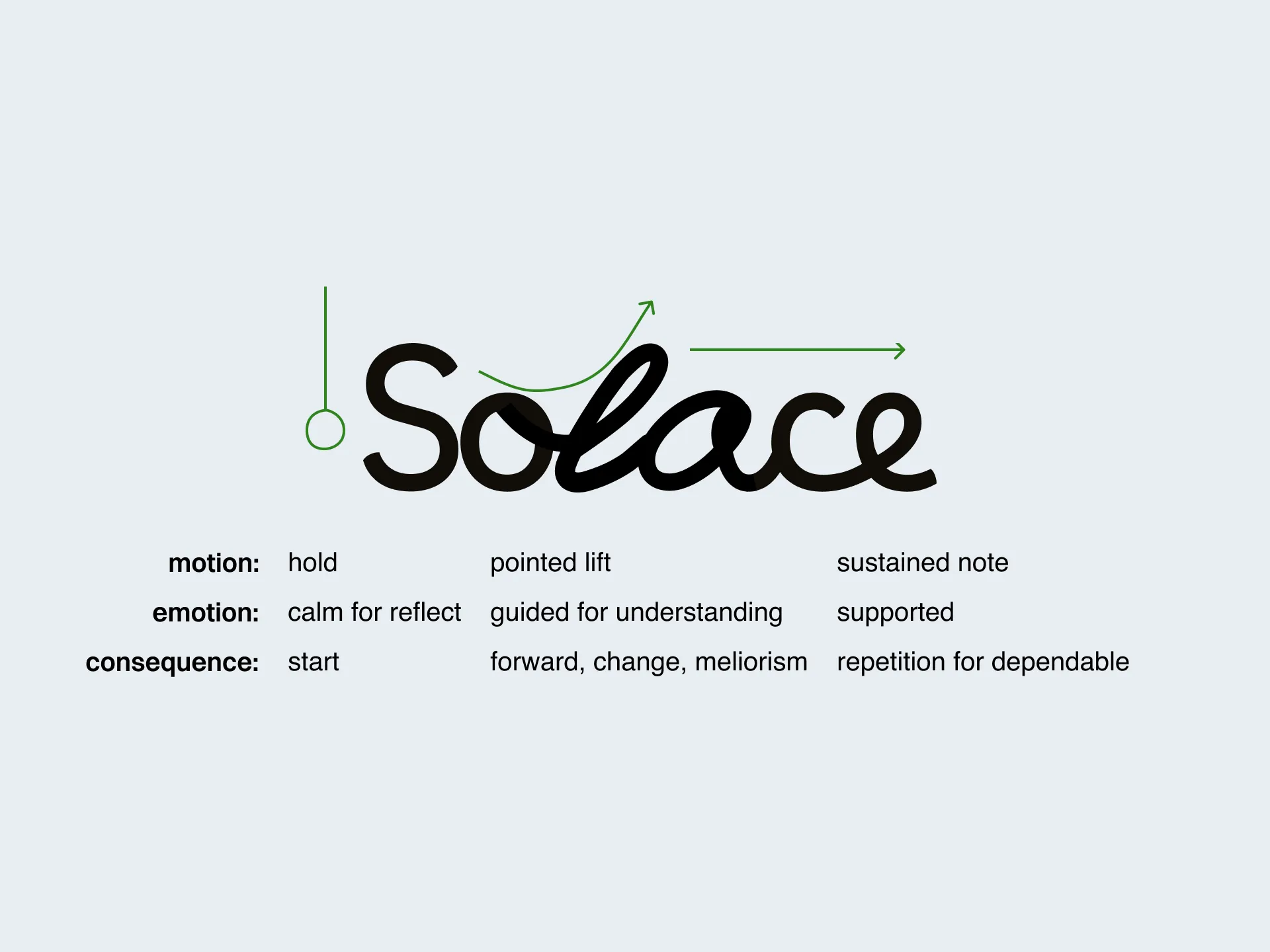
With a playful logo, philosophical name, the rest of the branding needs to support our remaining goals: feeling better and being there when you need it.
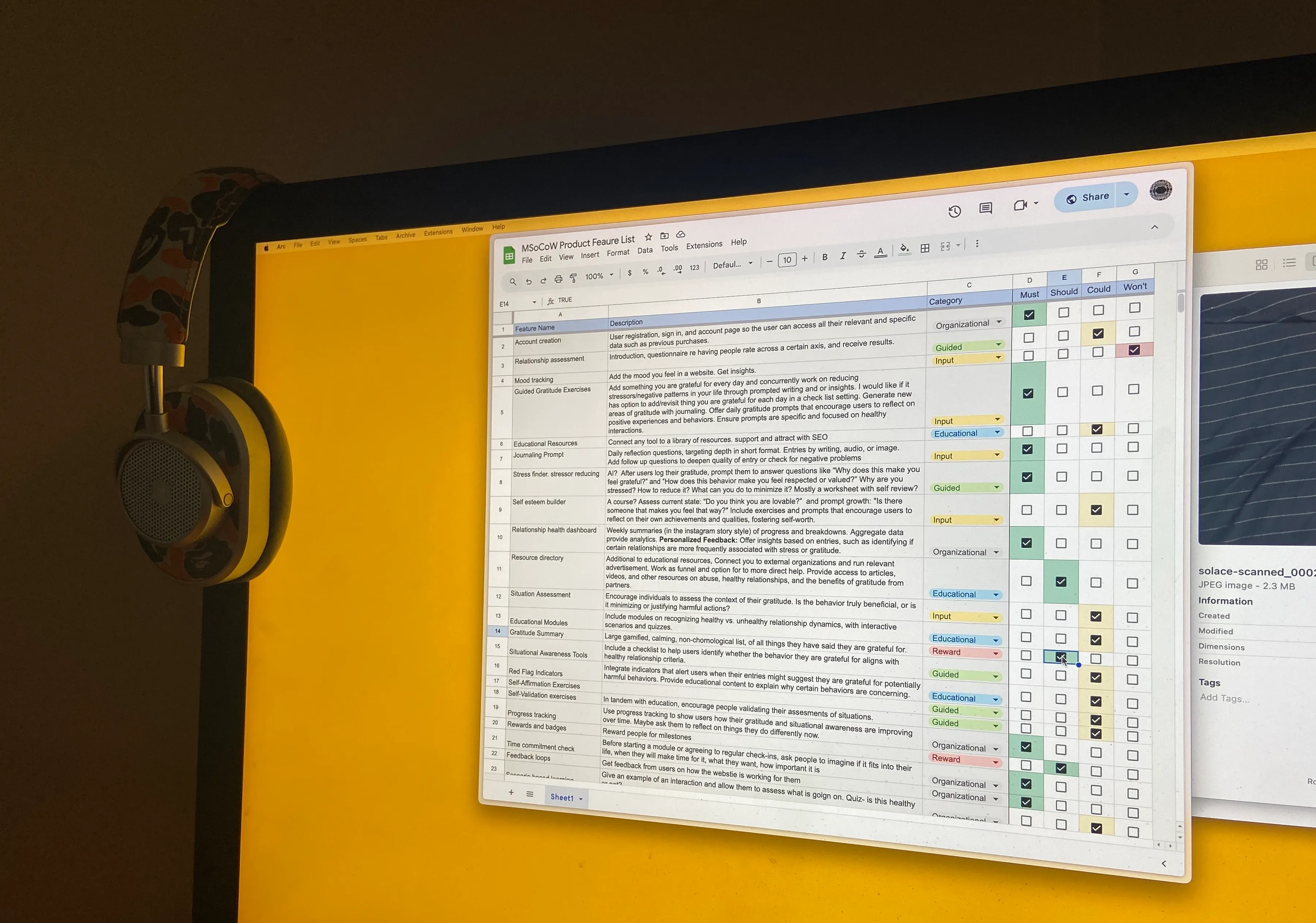
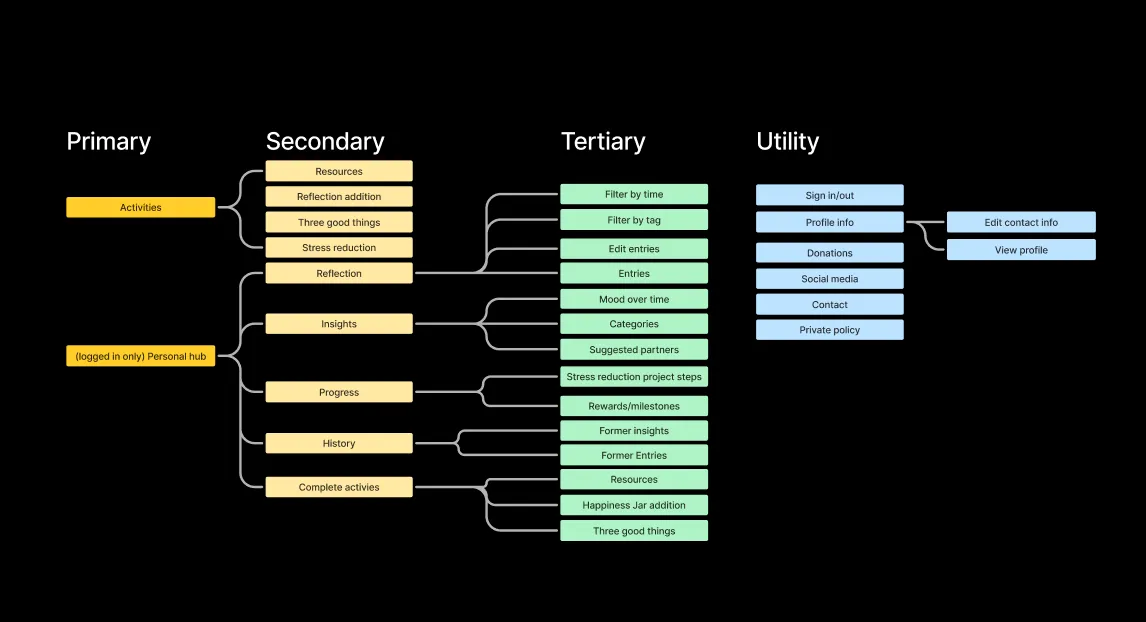
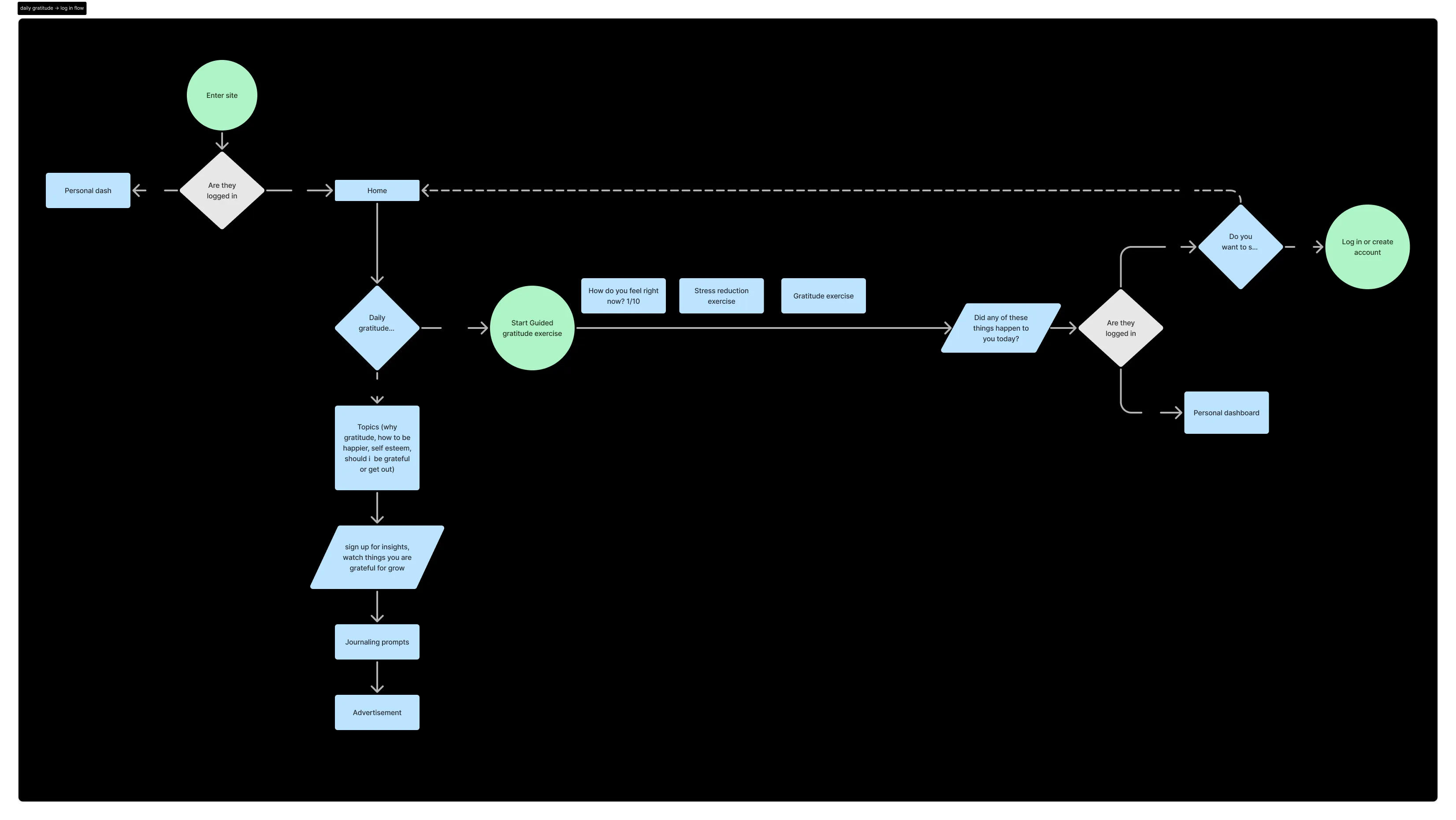
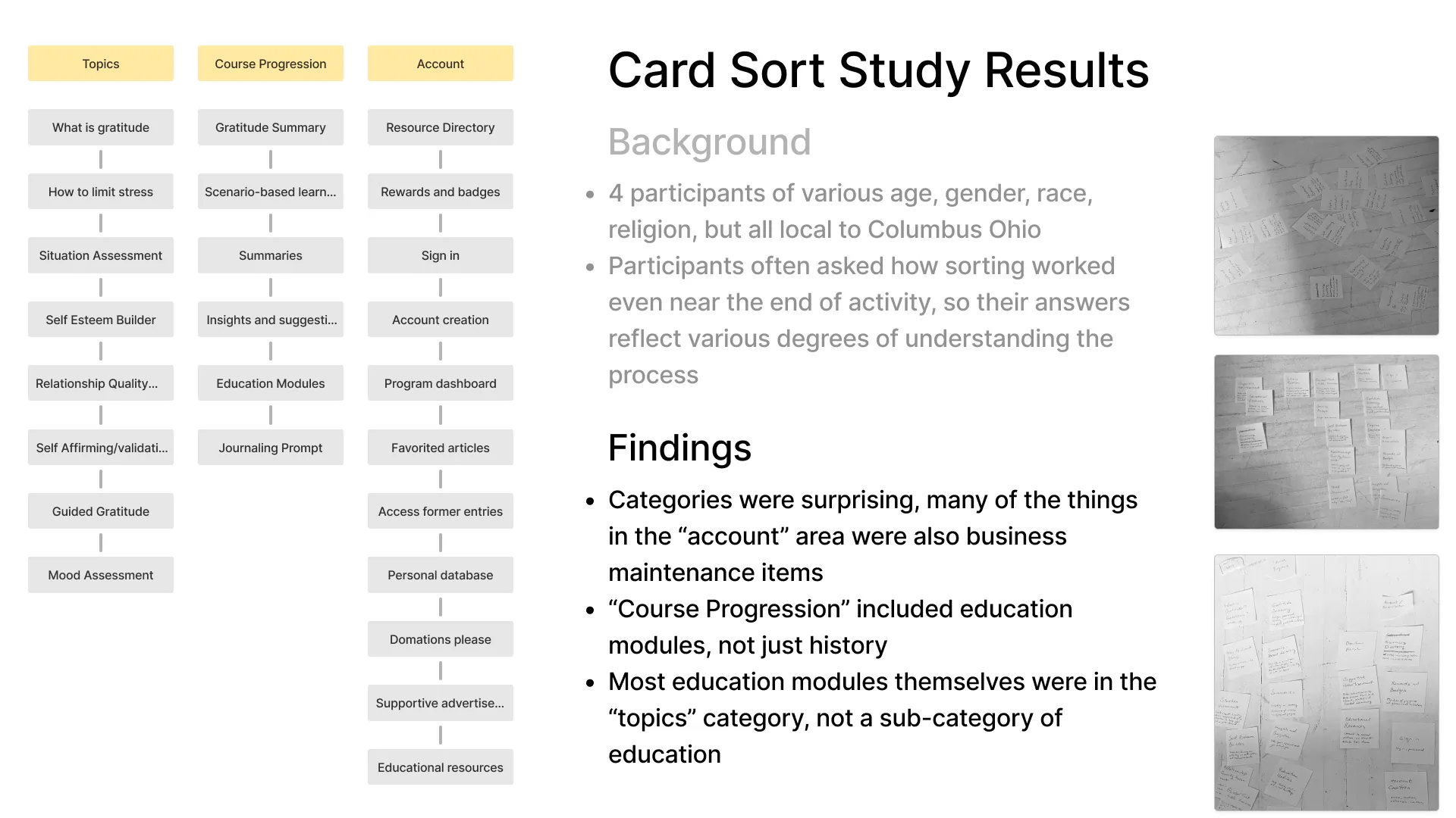
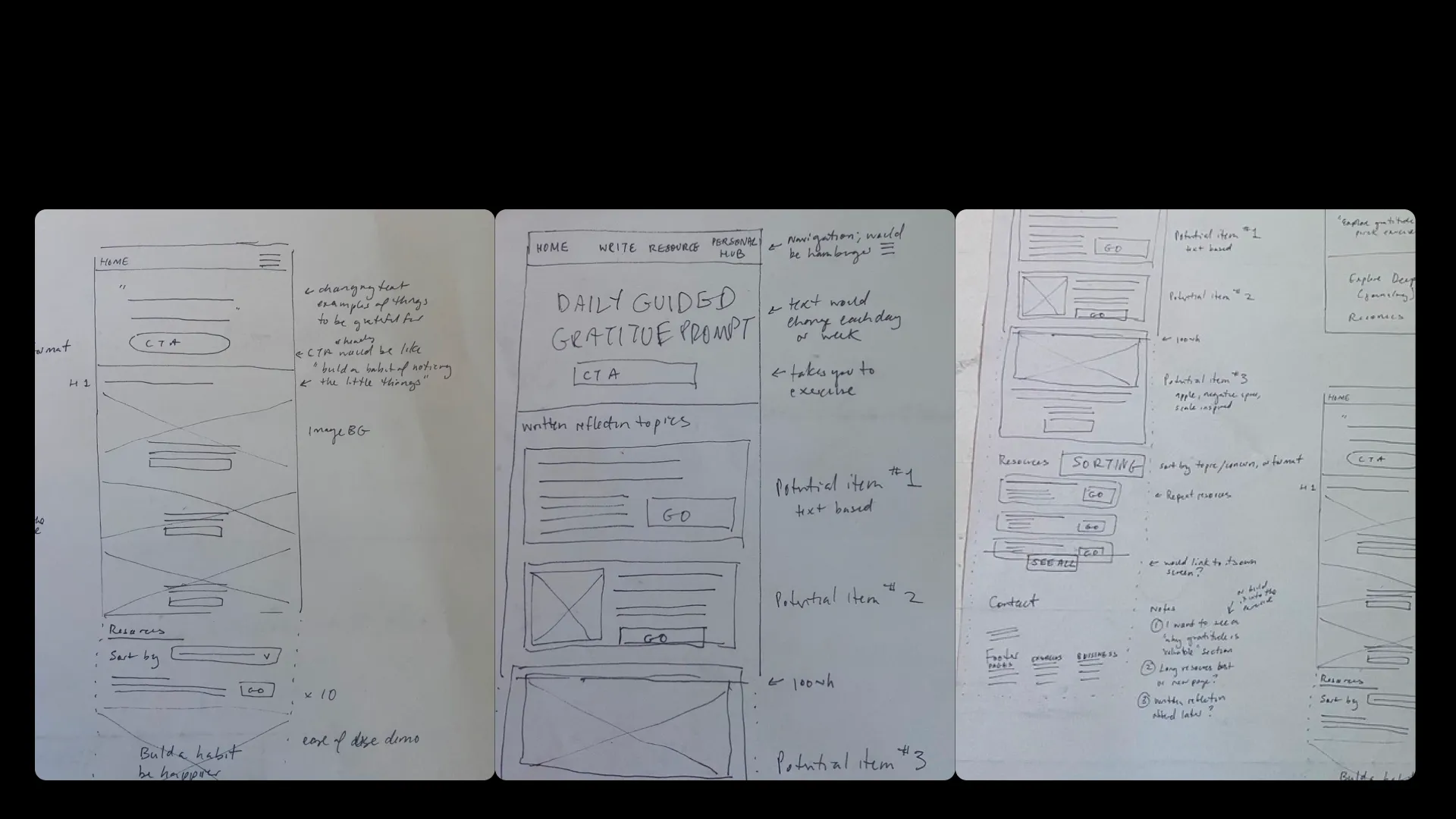
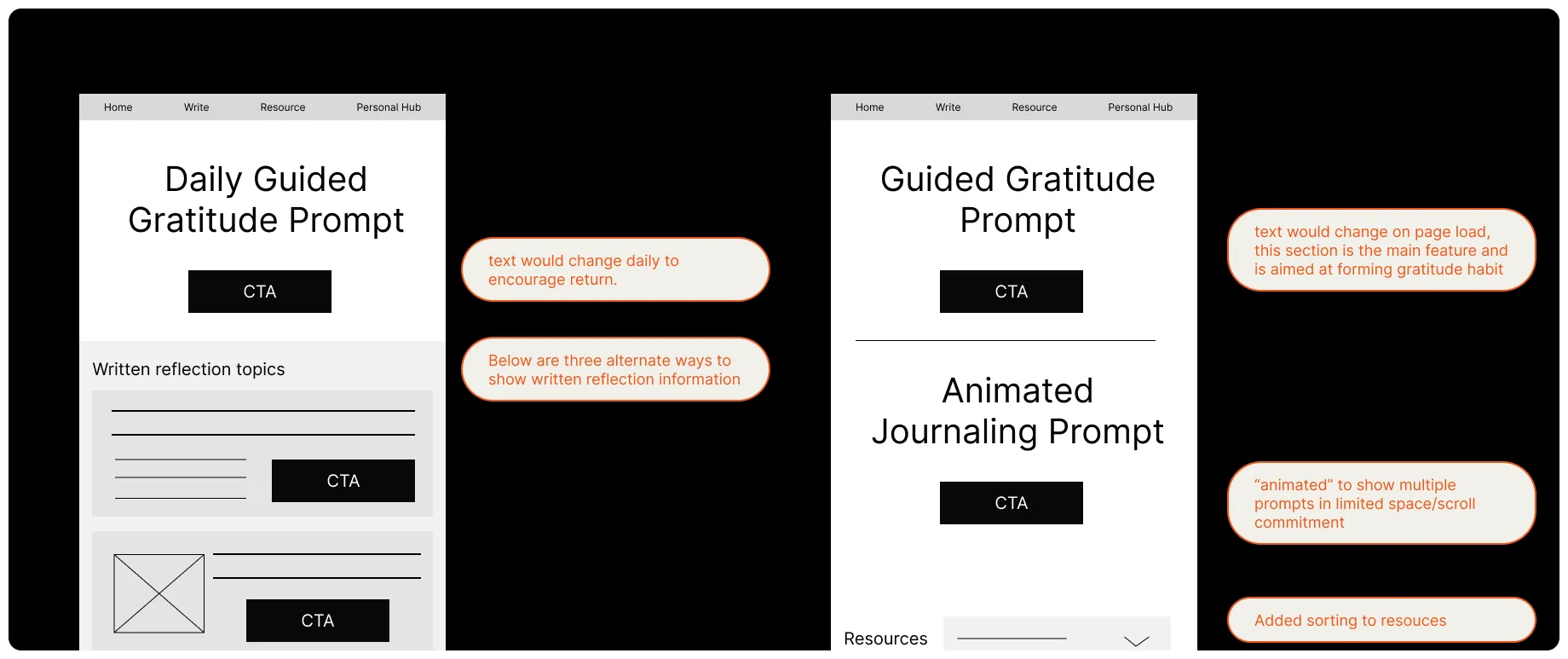
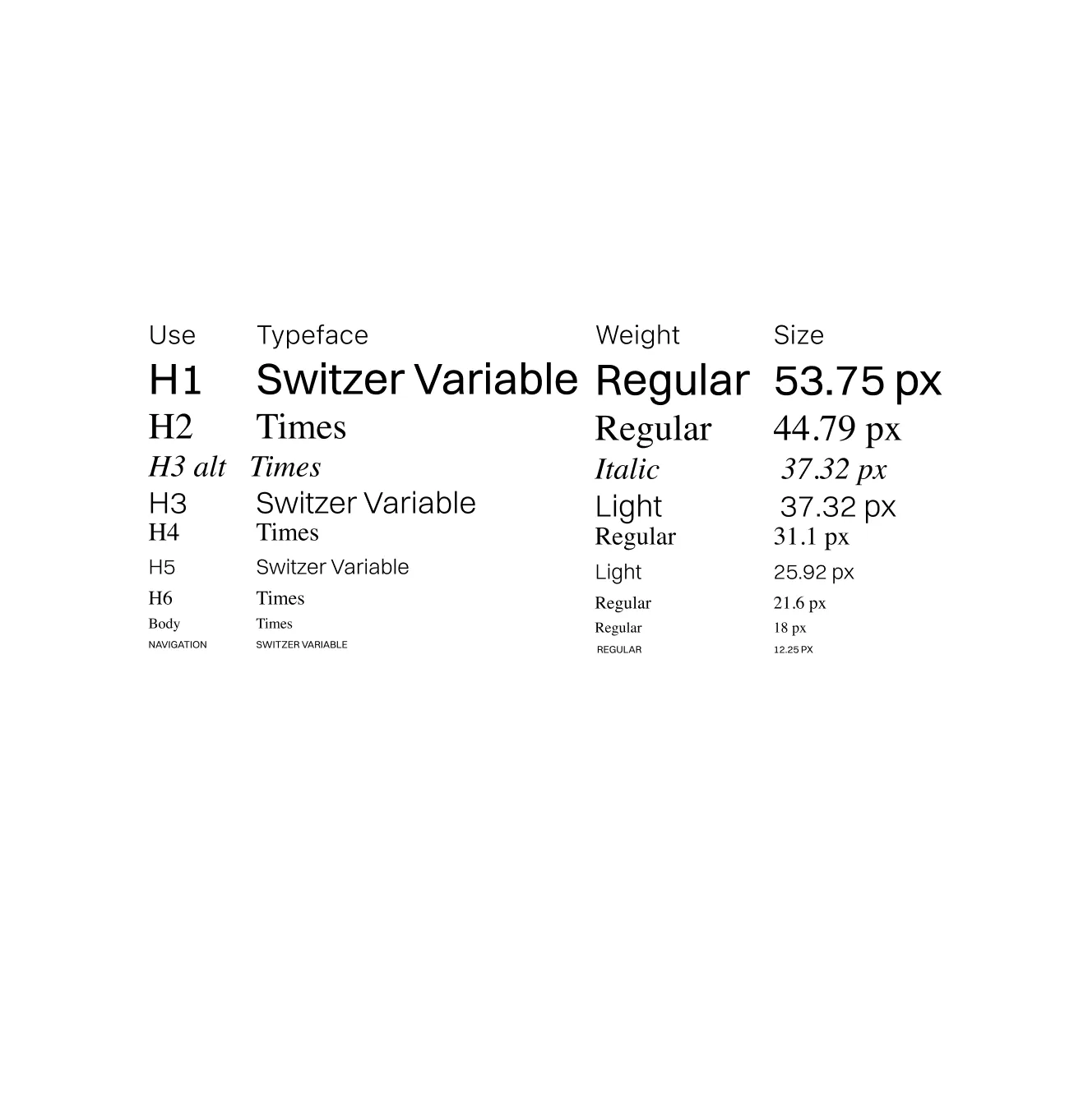
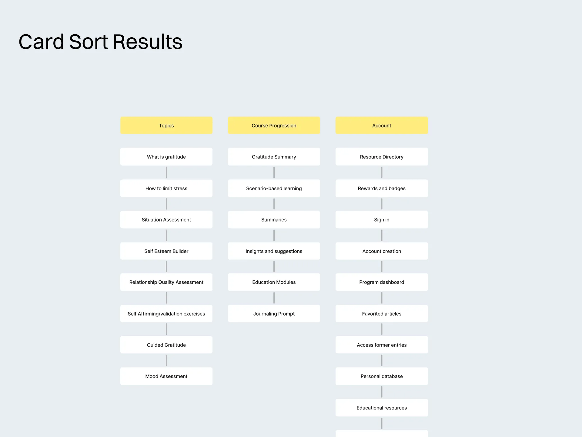
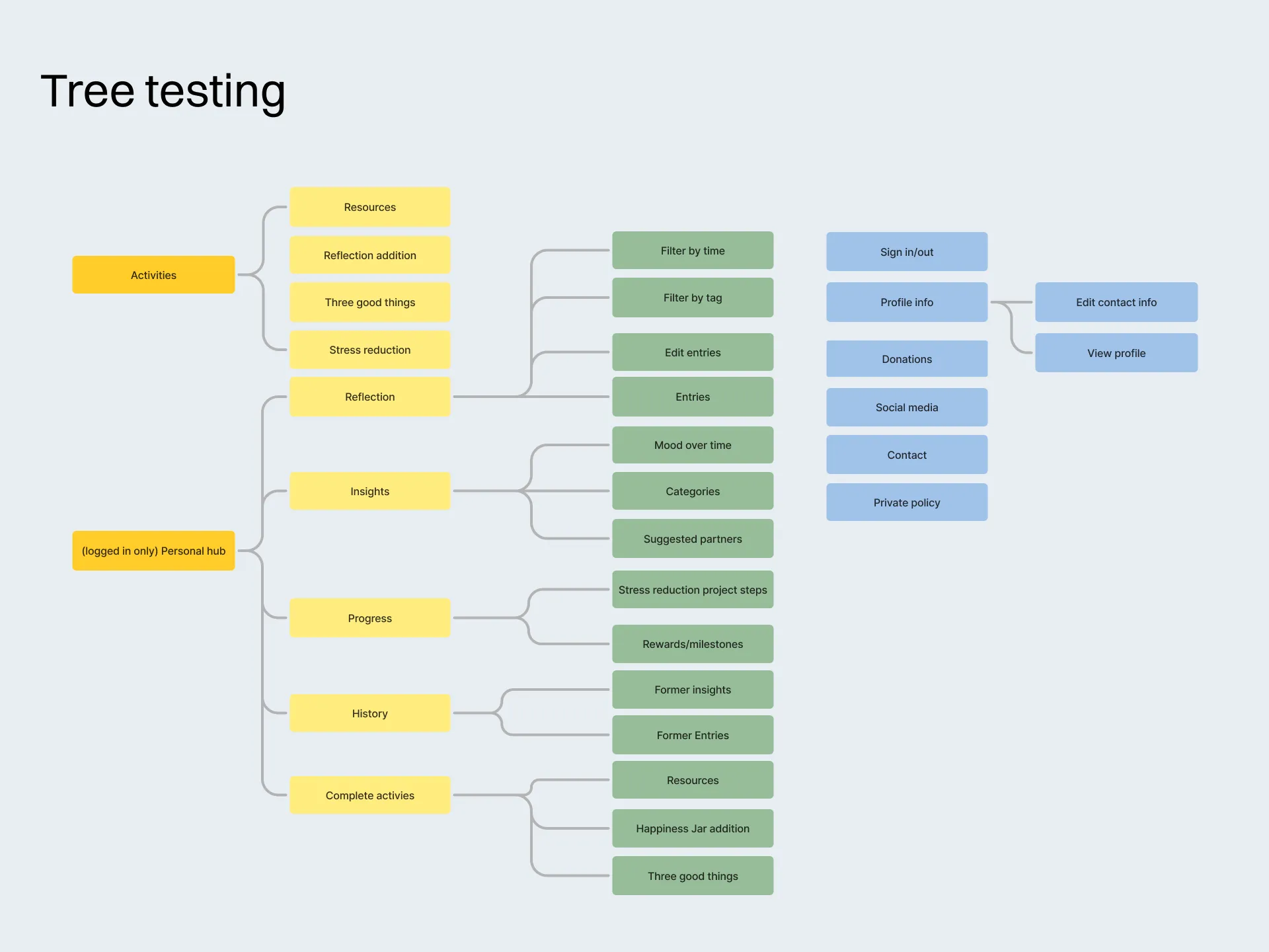
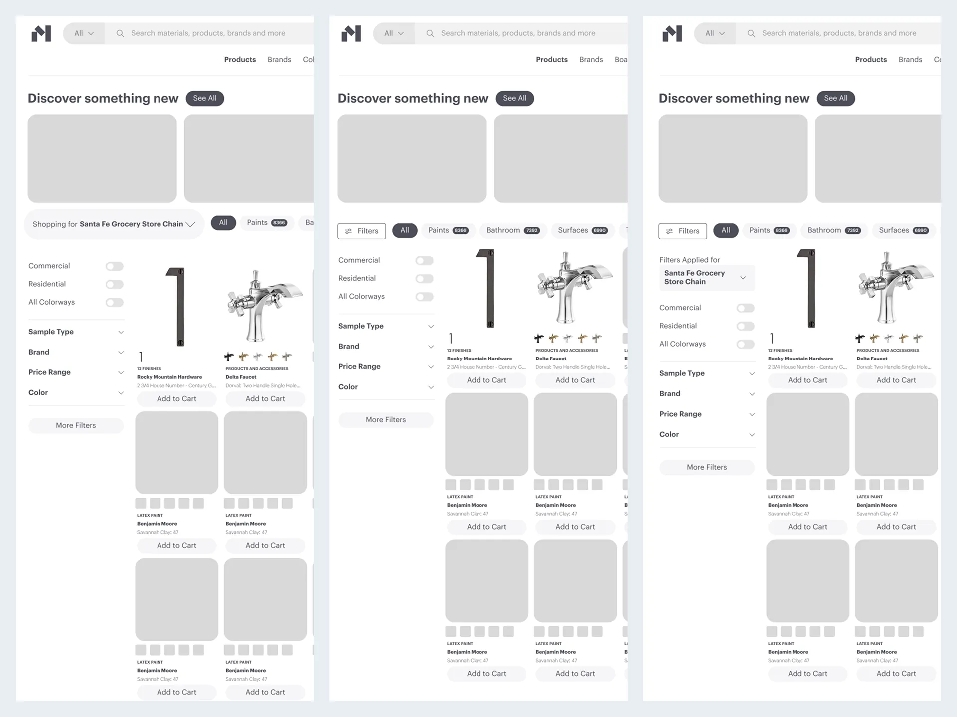
Roadmap to Wireframe
The chosen and eliminated features resulted in new content arrangement for the site to increase accuracy and satisfaction.
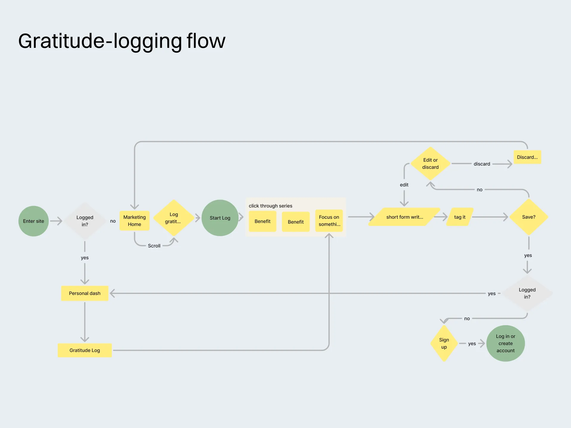
Testing and High Fidelity
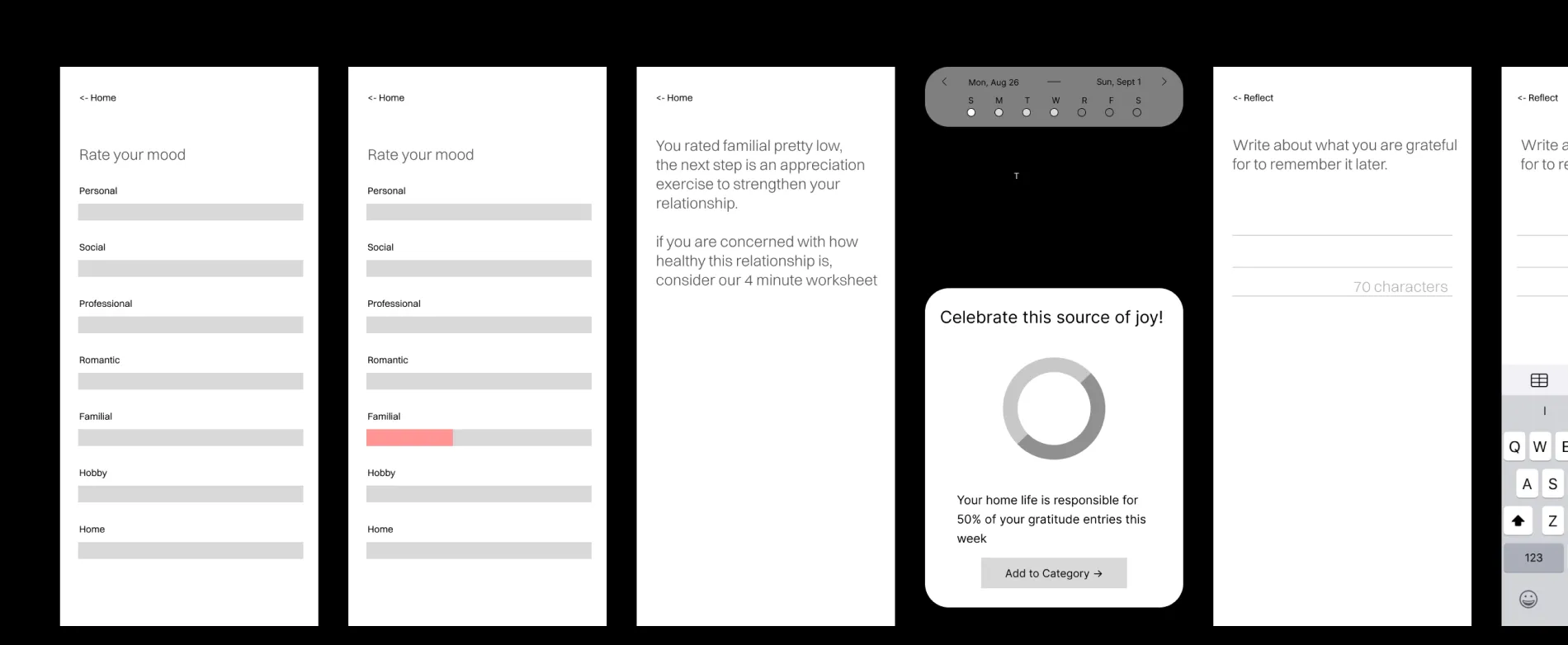
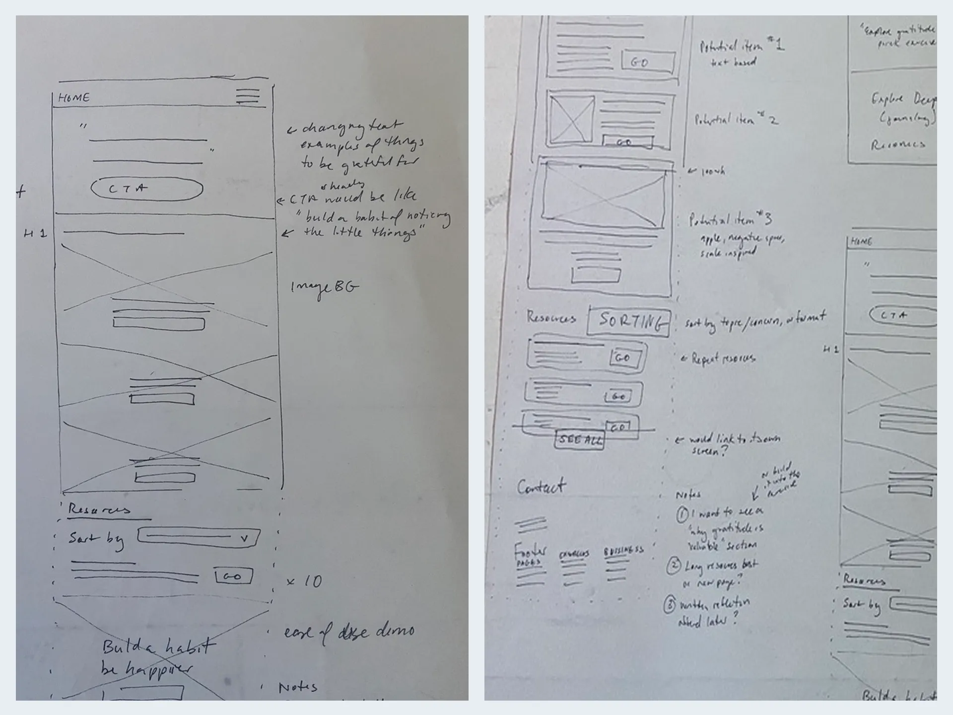
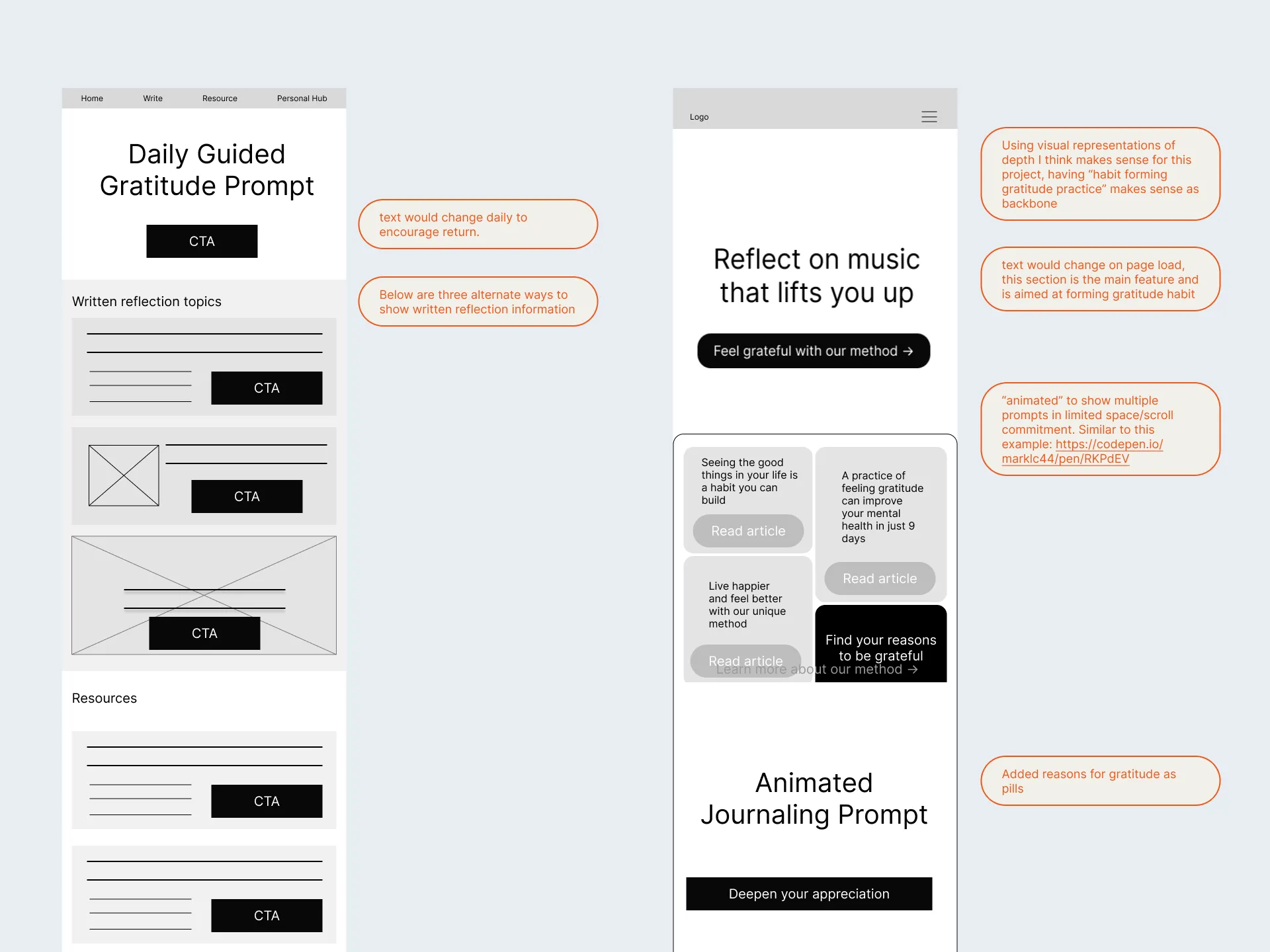
This section will go through the development of each feature, including feedback from usability testing. Without futher ado:
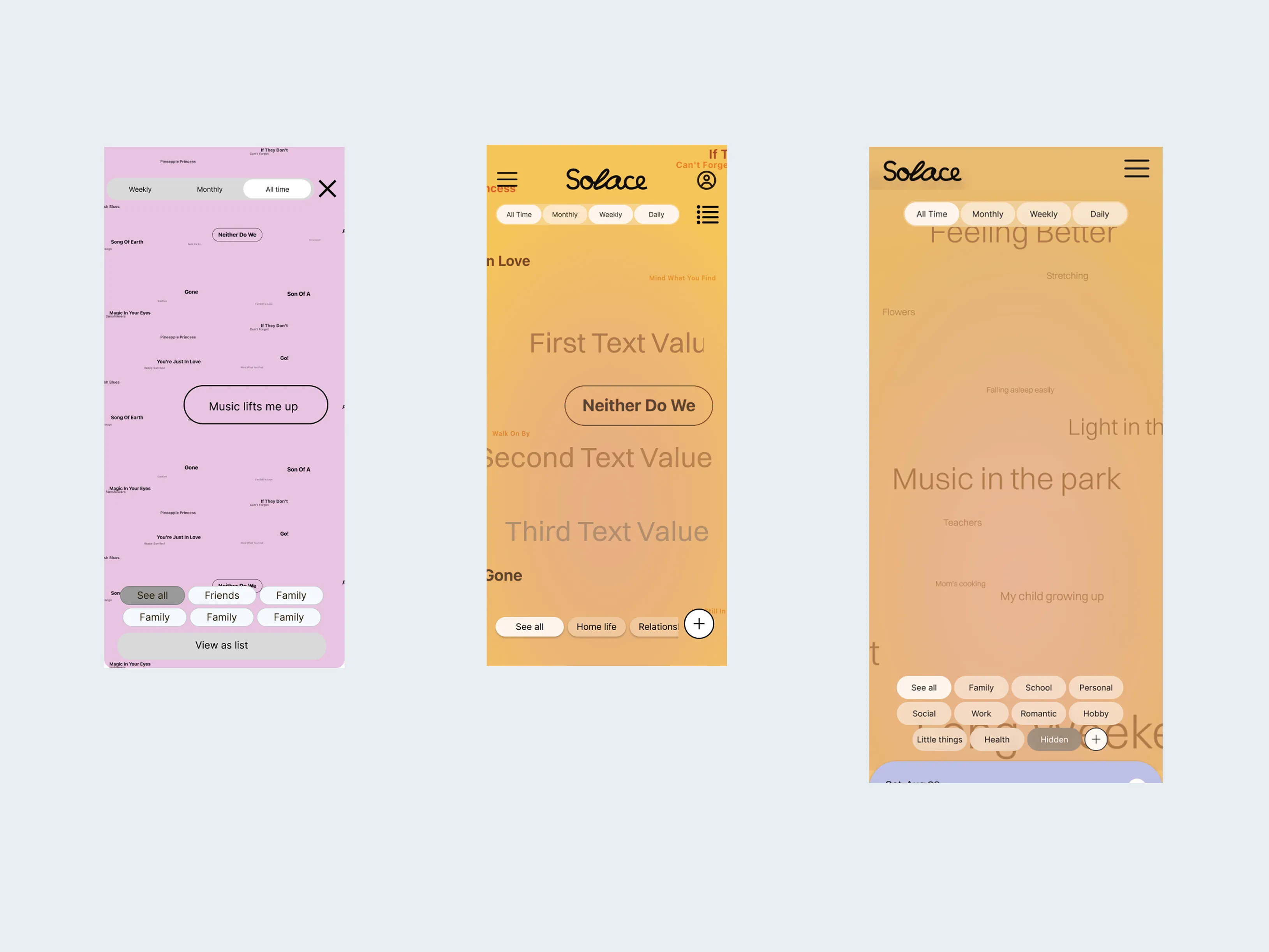
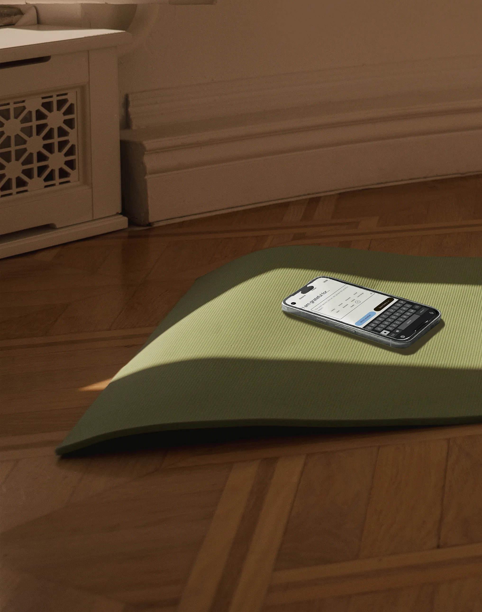
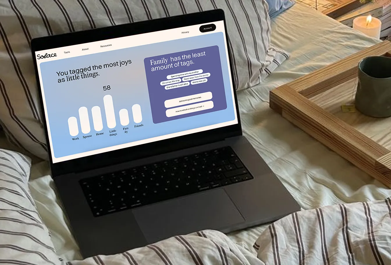
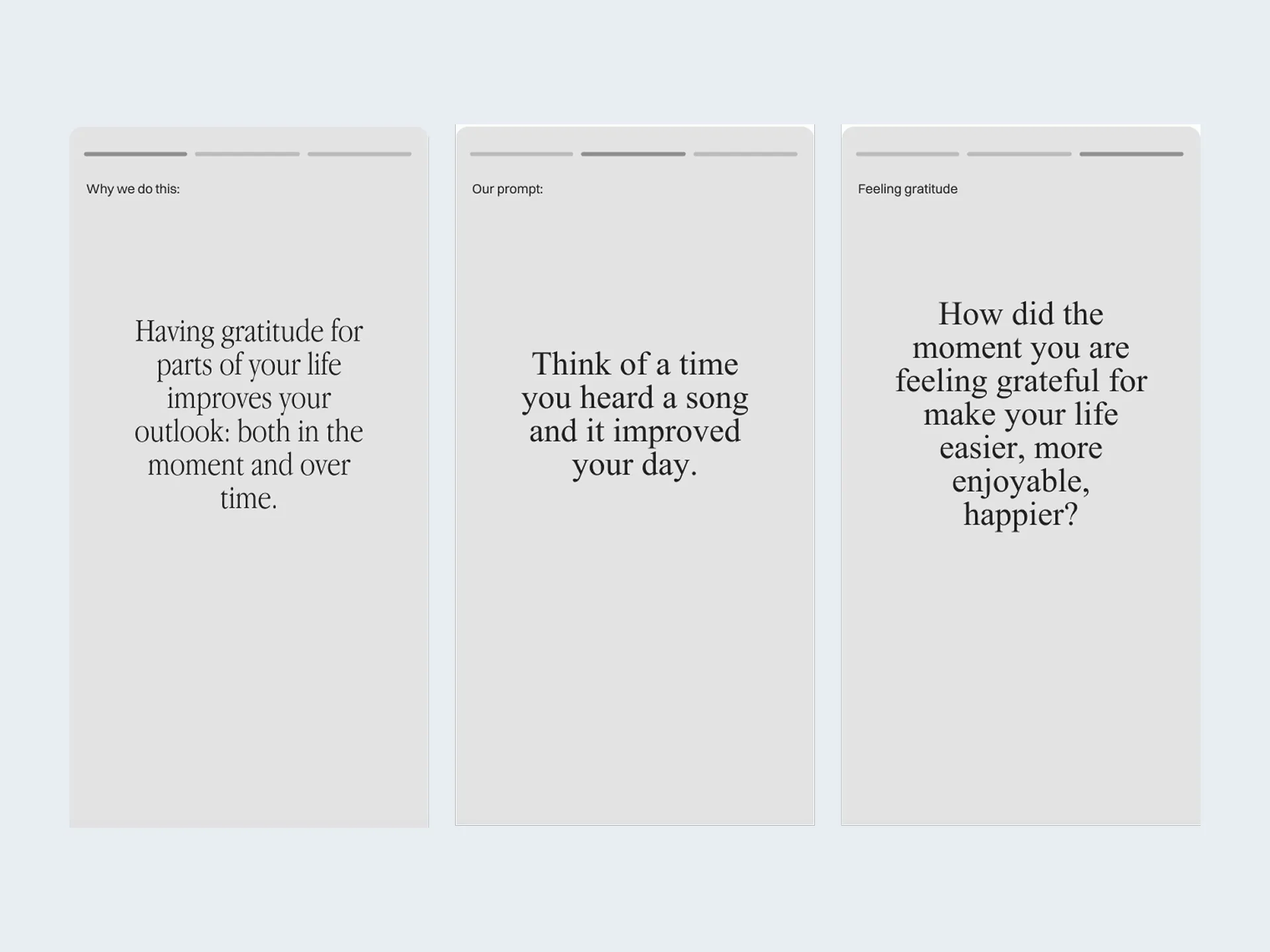
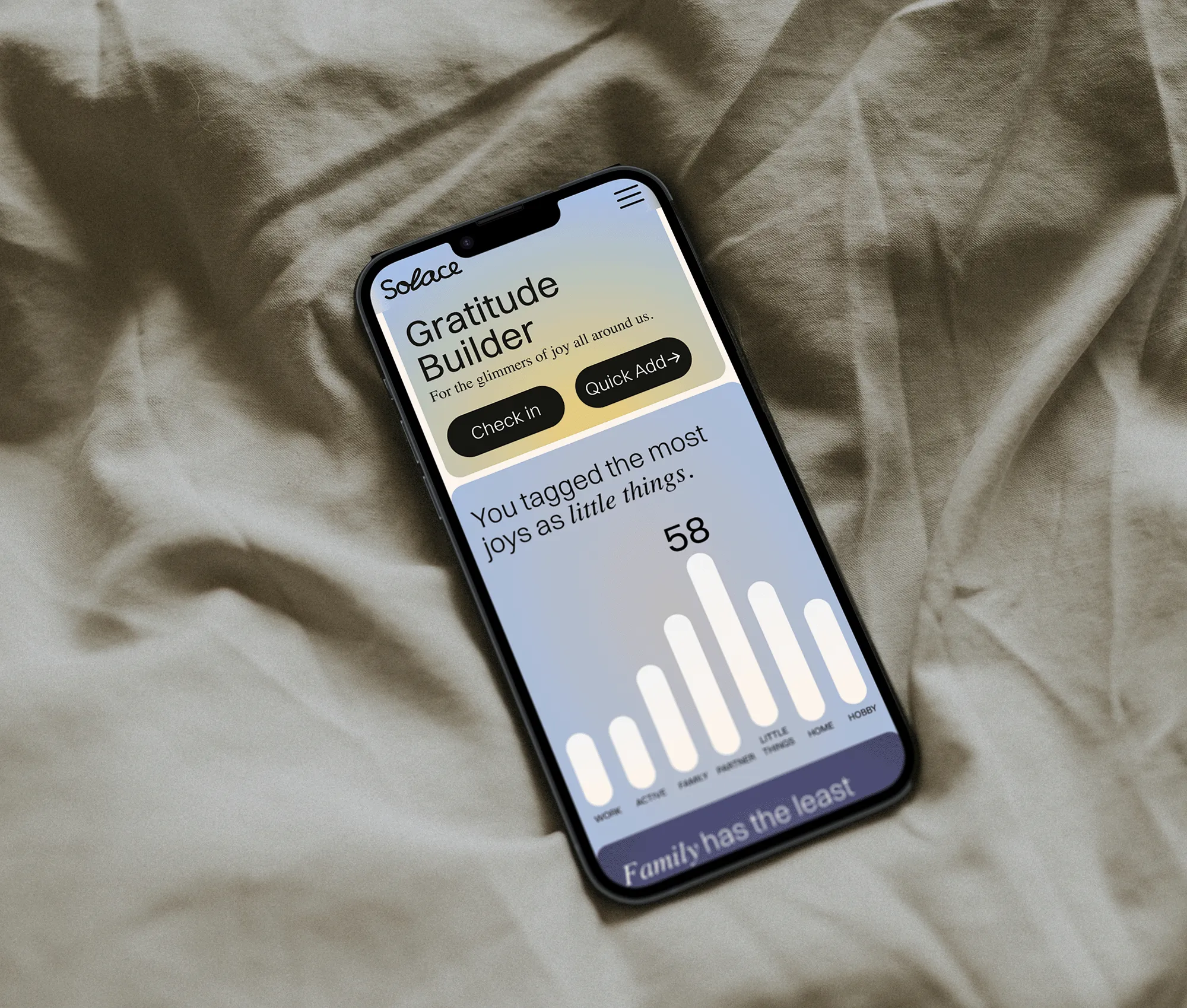
Reflecting on gratitude.
The list icon was unsuccessful in testing, and the add an entry plus icon looks like add a tag.
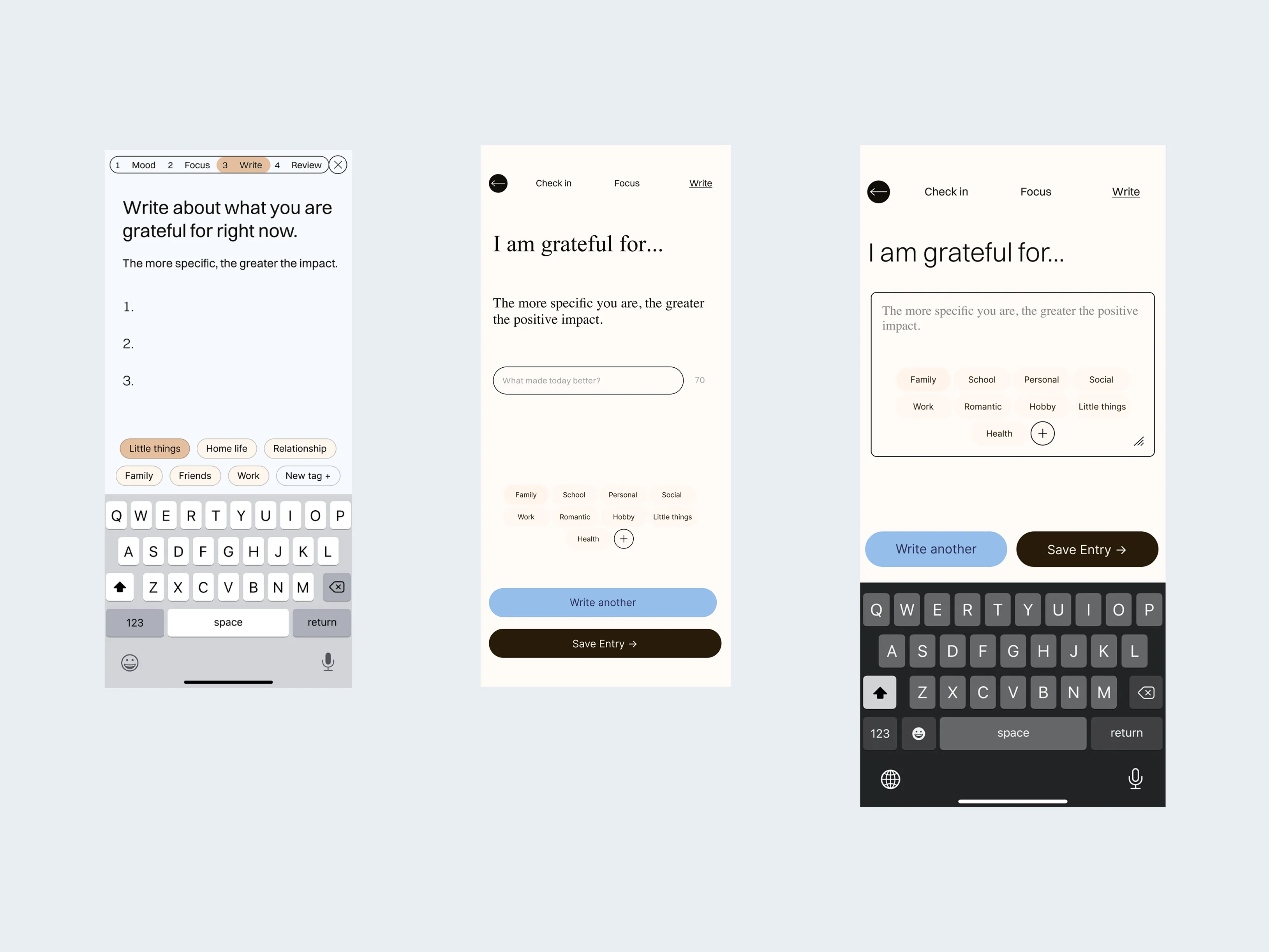
Writing about gratitude.
There is an option for short form or long form writing on the same screen.
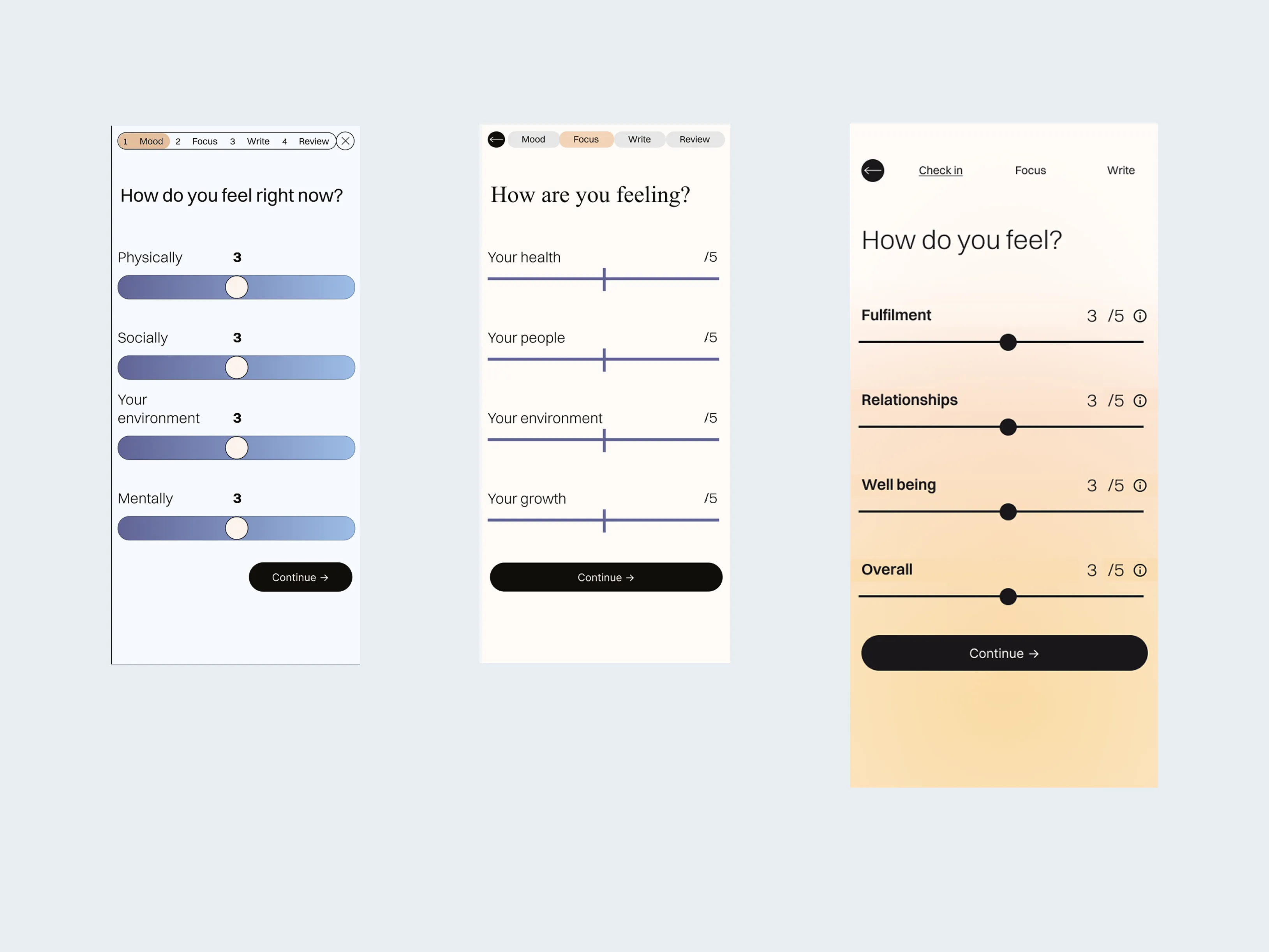
Mood tracking.
The first sliders were too distracting and the field labels were intimidatingly ambiguous.
There is an option for short form or long form writing on the same screen.
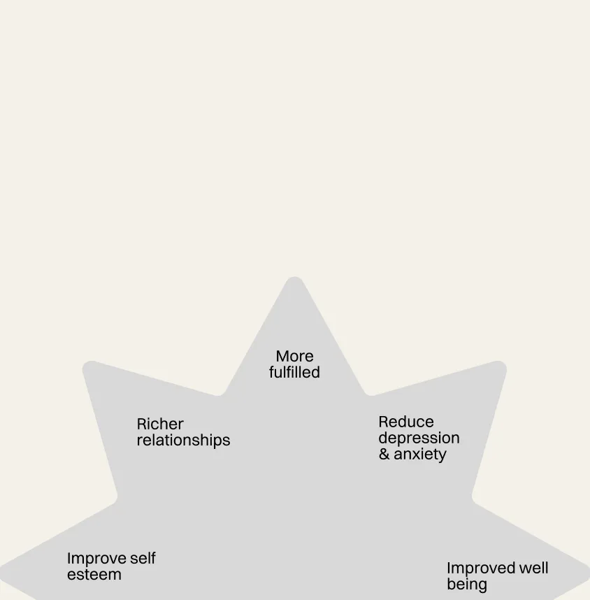
Impact
The best part of making Solace has been getting feedback from people saying they wished they had it for their sobriety journeys, grieving a loved one, or just getting older.
Solace as a prototype brought joy and expressed interest in returning to it. It combines insights from fundamental issues regarding enjoying life and relationships with utility in the practice of reflection.