(a) What is industry standard?
- Research Plan (OPTIONAL)
- Outlines the research methods used, reasons for selecting research methods - Competitor analysis (OPTIONAL for responsive)
- The analysis has least 3 competitor's primary service and product features
- Written explanation provides details on summary of key findings, identified opportunities, competitors' strengths and weaknesses - User interviews
- Interview results clearly address the research goals and questions from the research plan
- Results do not assume a solution
- Written explanation provides a summary of key findings - Survey (OPTIONAL)
- Survey results clearly address the research goals and questions from the research plan
- Results do not assume a solution
- Written explanation provides a summary of key findings - Card sorting (OPTIONAL)
- The exercise has been done with 3-5 potential users using 30-60 topic items
- The results have been recorded in a detailed document
- Written explanation includes a summary, key takeaways, findings, and opportunities identified
(b) Synthesis
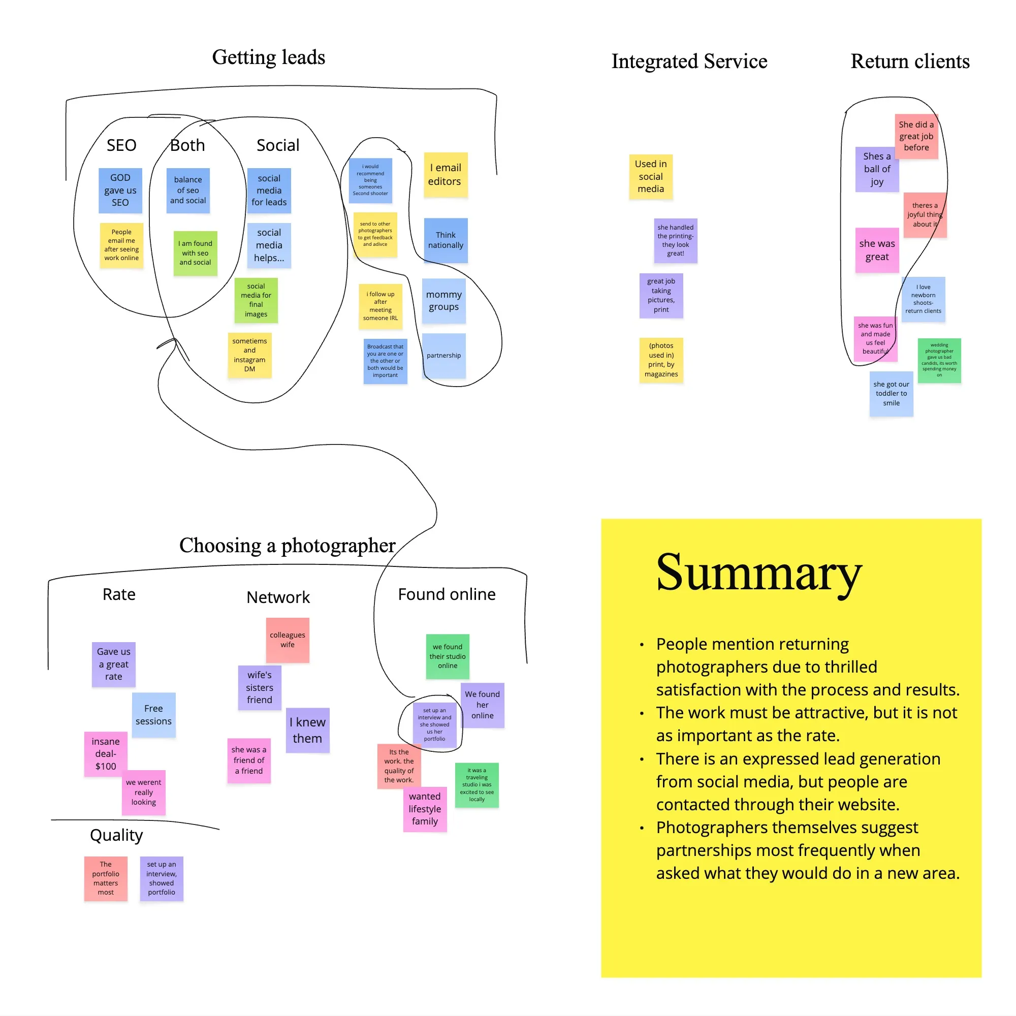
- Research Synthesis ((ie. Affinity Map, Empathy Map, Customer Story Map, Journey Map, Storyboard, How Might We, etc.)
- Includes sufficient key findings from all executed tests
- Presentation is clear and has subcategories and other aspects to go more in depth
- Goes into detail with specific comments from users
- Reflects the chosen persona in a relevant way, offering key learnings of the persona's life with quotes and key insights about their day-to-day experiences in relation to the product - User personas (Required for 2 /3 )
- Persona is relevant and based on research results
- The persona not only shows a character (demographics and background bio), but their role in relation to the product is very clear
- The persona specifies pain points, goals, and other important details related to the project
- Written explanation discusses key findings such as relevency to the project, personality traits, highlights of user pains and needs
(c) A/B testing
(d) Prioritization
- Project Goals (Optional)
- The shared goals between business and users are relevant
- Pain points and goals observed go beyond the obvious, offering a more thorough and detailed study - Feature Roadmap ( Required for 1 /3 )
- Essential and main elements are reflected in the document
- Written explanation discusses prioritization rationale - Site Map
- Task flow / user flow (2 /3)
- Includes at least either user flow or task flows
- Flow diagram uses symbols correctly (diamonds for decision points, circles for start and end points, rectangles for everything else)
- Written explanation discusses rationale behind the flows based on prior research
- Written explanation includes key takeaways, findings, and opportunities identified
(e) Branding
- Moodboard (OPTIONAL)
- Style tile (OPTIONAL)
- Branding (Required for end to end )
- The branding and logo matches the brand values and the audience
- Logo is optimized and ready for many different sizes and usages
- Written explanation discusses rationale for logo concept, inspiration, colors, etc - Hand sketches (OPTIONAL)
- Sketches show the foundation for the UI
- Written explanation discusses design rationale, thought process behind iterations, and details for key screens based on prior research
(f) Prototype
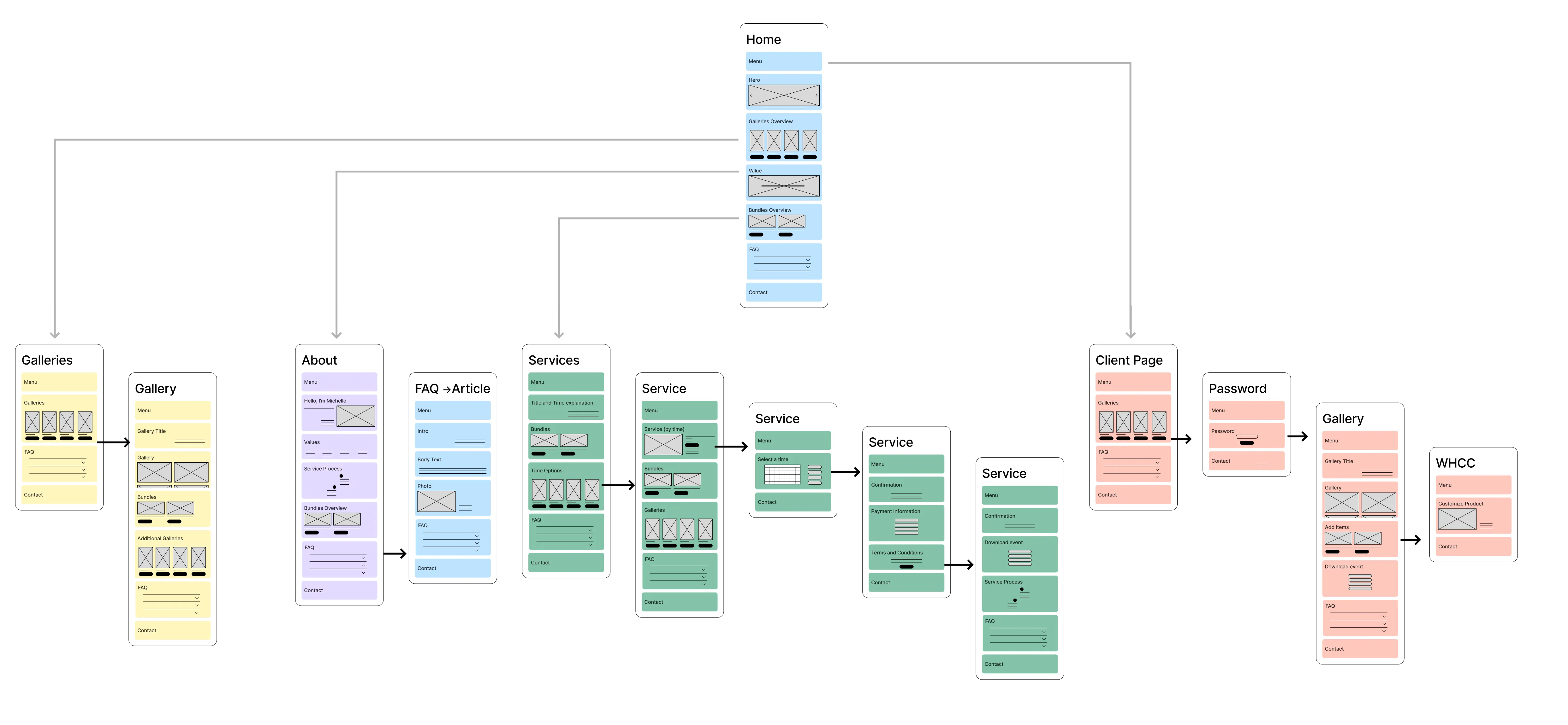
- Lofi Yes - minimum 5 unique screens for each case study*For Responsive Website case study: there needs to be a minimum of 5 unique screens in the format of choice (mobile, tablet or desktop) and additionally at least 3 screens in a secondary format of choice (mobile, tablet, desktop).For Feature-Add case study: there can be a minimum of 3 unique screens.
- Wireframe shows exploration and iterations
- Good and clear presentation of at least 5 key screens
- The wireframes clearly show that the content and purpose of every block on a screen
- Enough wireframes of key screens were created to test a complete flow
- The wireframe elements have been thoughtfully considered, and the annotations make sense in context
- Written explanation discusses design rationale, thought process behind iterations, and details for key screens - Hi-fi Wireframes (also referred to as Hi-fi Mockups)
YesFor Responsive Website case study: there needs to be a minimum of 5 unique screens in the format of choice (mobile, tablet or desktop) and additionally at least 3 screens in a secondary format of choice (mobile, tablet, desktop).For Feature-Add case study: there can be a minimum of 3 unique screens.For End-to-End case study: there can be a minimum of 5 unique screens.
- Wireframe shows exploration and iterations
- Good and clear presentation of at least 5 key screens
- The wireframes clearly show that the content and purpose of every block on a screen
- Call out a few key screens to discuss at a deeper level of detail
- Enough wireframes of key screens were created to test a flow
- The wireframe elements have been thoughtfully considered, and the annotations make sense in context
- Written explanation discusses design rationale, thought process behind iterations, and details for key screens
(e) Acessibility Testing
- Test plan
- Usability test results ((Note: it is an expectation that you'll have insights on changes to make to your work. If you do not, speak to your mentor about what might have gone wrong.))
- Testing conducted with less than 3 people
- Summary of synthesis is missing - Click through prototype (2 case studies)
- Final Results / impace
A big gap that was isolated was the difference between the people want to have professional photography but cannot, like Sasha, and those who need professional photographers to fill a need, like Lianne. There had to be a way to market the product to suit both needs. One person needs this to be smooth, the other needs this to be more accessible, they both want to feel excited and comfortable. Those things together sound like a lovely moment for a interjection of human centered design.
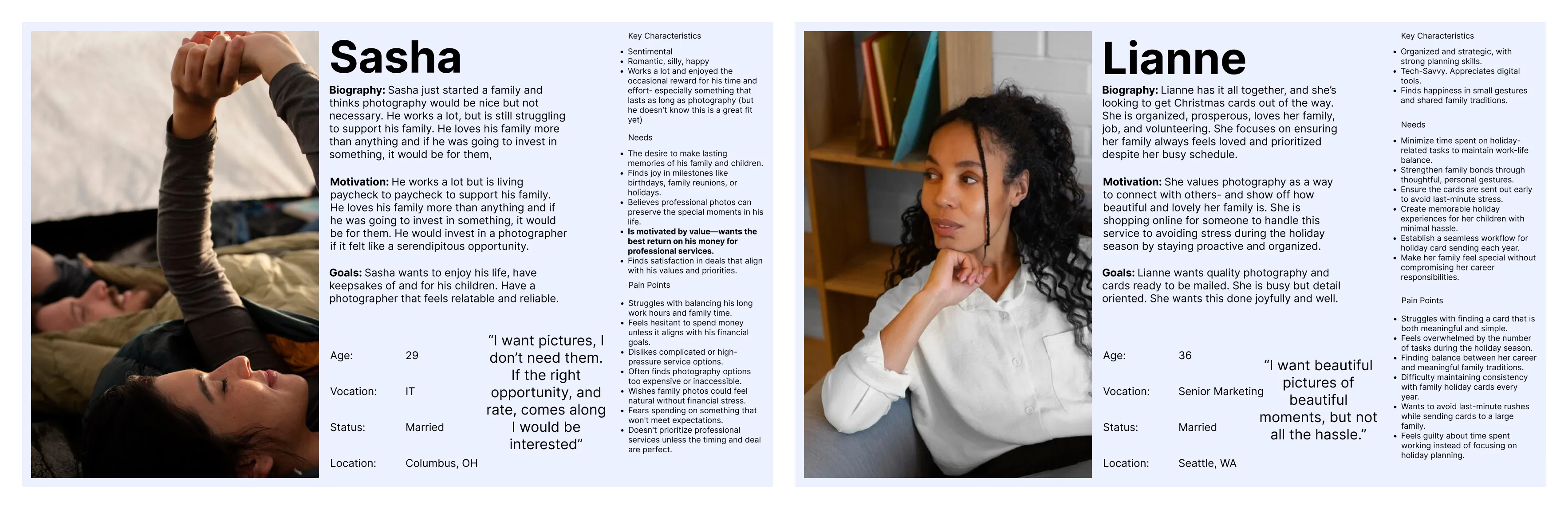
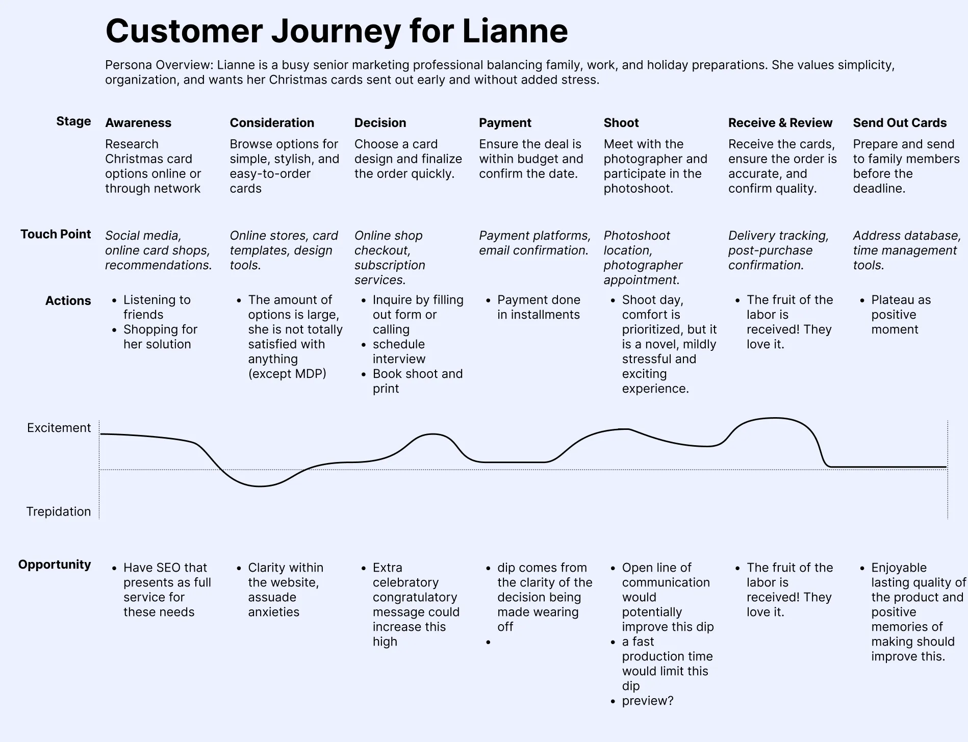
Bridging these needs meant designing a customer journey that felt both elevated and approachable. For Sasha, who aspires to professional-quality photos but sees cost and access as barriers, the experience needed to feel unintimidating and flexible—emphasizing low-pressure entry points, transparent pricing, and clear guidance. For Lianne, who seeks a streamlined, no-hassle process, clarity, efficiency, and follow-through were paramount. Mapping both journeys revealed shared emotional highs—like feeling seen, celebrating milestones, and enjoying the final product—and shared lows, including confusion, decision fatigue, and uncertainty. By building in touchpoints that restored confidence (like previews, confirmations, and warm messaging), and removing friction where possible, the site design creates a unified path that can scale up or down depending on the client.
(g) UI Design
- Ui design
- Final design shows exploration and iterations of visual design and UI design
- Call out a few key screens to discuss at a deeper level of detail
- Written explanation discusses design rationale, thought process behind iterations, and details based on branding and art direction - UI Kit
- UI kit includes all key elements
- UI elements are properly labeled and easy to understand